From bland to grand: evoke emotions with colors in web design
Colors are like secret weapons in web design. They have this magical ability to stir emotions, set vibes, and even influence how users behave. As designers, tapping into the psychology of colors can take our designs to a whole new level!
So, let’s dive into the exciting world of color psychology and see how we can use different color schemes to create awesome user experiences.
The science behind color psychology
Color psychology is all about how colors mess with our minds and emotions. It’s fascinating!
For example:
Red: It’s all about passion, energy, and urgency. It can pump us up and get us going!
Blue: Ahh, the color of tranquility and trust. No wonder it’s used so much by reliable brands.
Yellow: The ultimate happiness booster. It grabs attention and radiates warmth!
Green: Nature, growth, harmony—it’s like bringing the great outdoors to our screens!
Understanding the cultural context
Colors have different meanings depending on where you are in the world.
So, while some colors might be universally understood, it’s essential to consider cultural differences.
White, for instance, can mean purity in the West, but it’s all about mourning in some Asian countries. Who knew, right?
Choosing the right color palette
When picking colors for a website, we gotta think about the brand and its vibe:
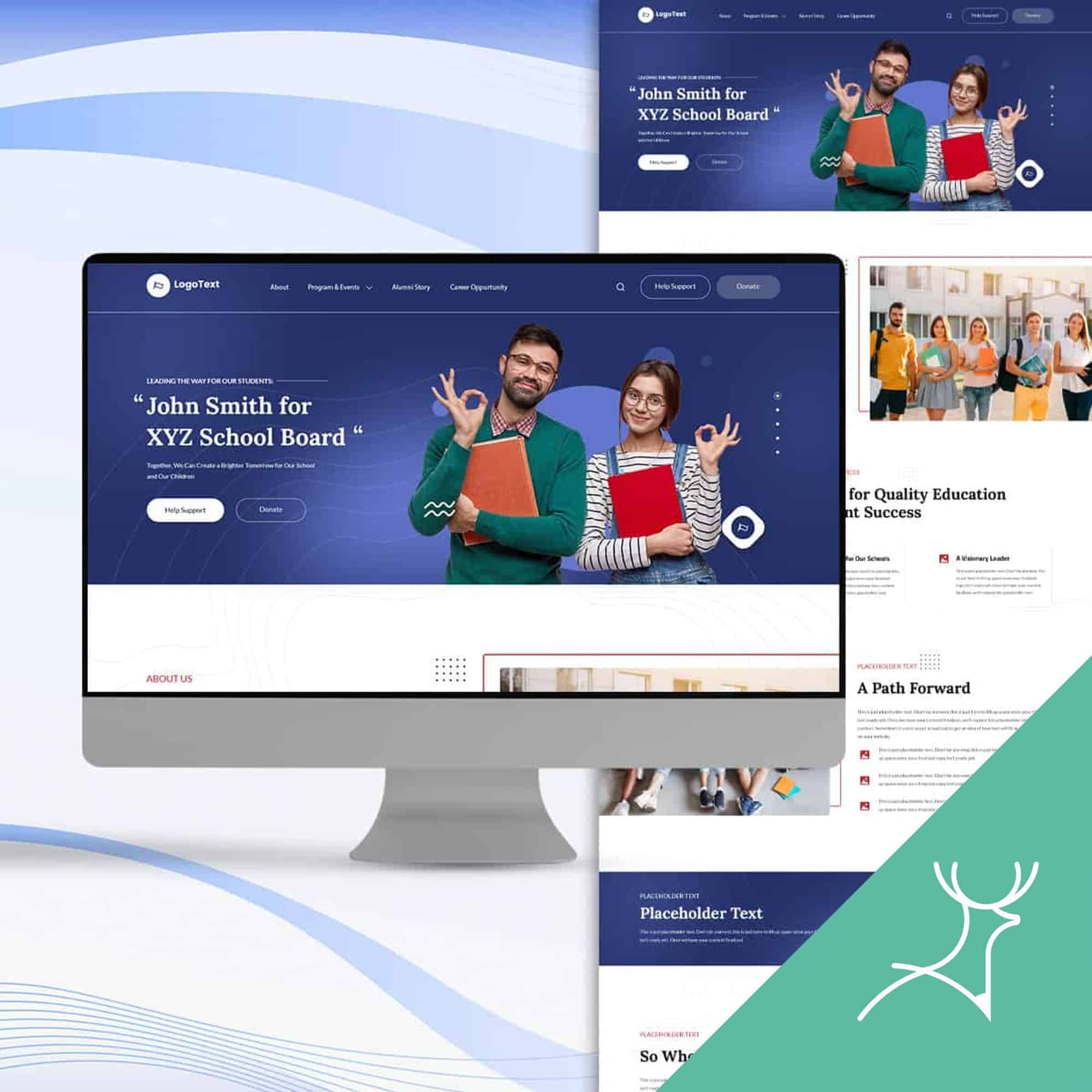
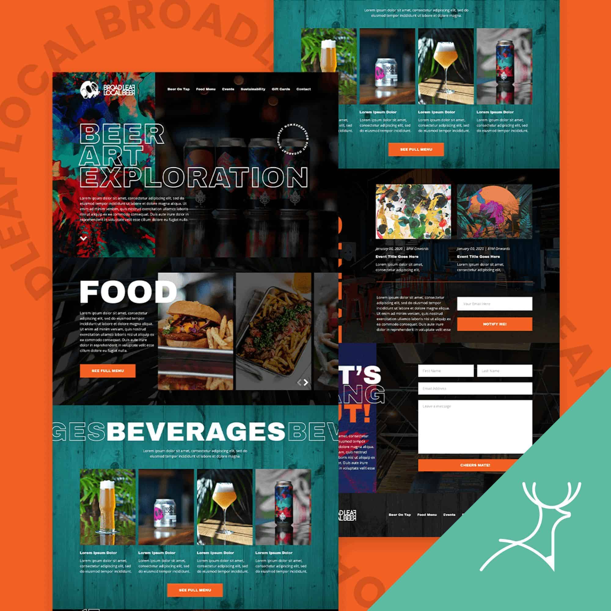
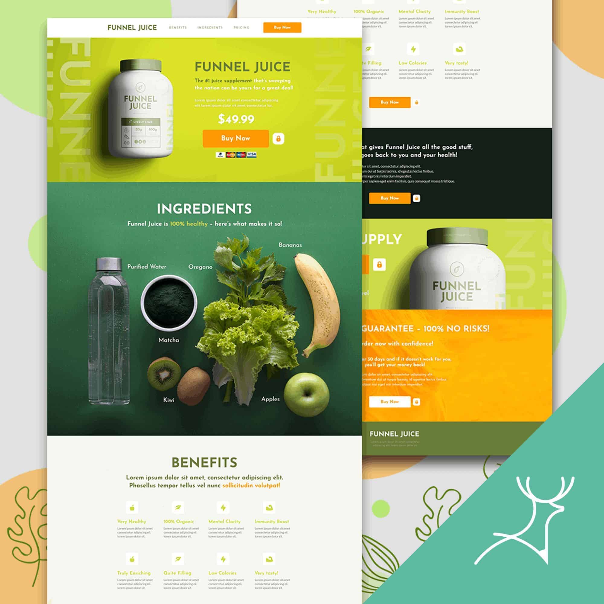
Brand Personality: What’s the brand all about? Modern and edgy or classic and conservative? Let’s make sure the colors shout out those traits!
Target Audience: We need to know who we’re designing for. If it’s kids, let’s go bright and playful. But for financial stuff, muted tones scream trustworthiness.
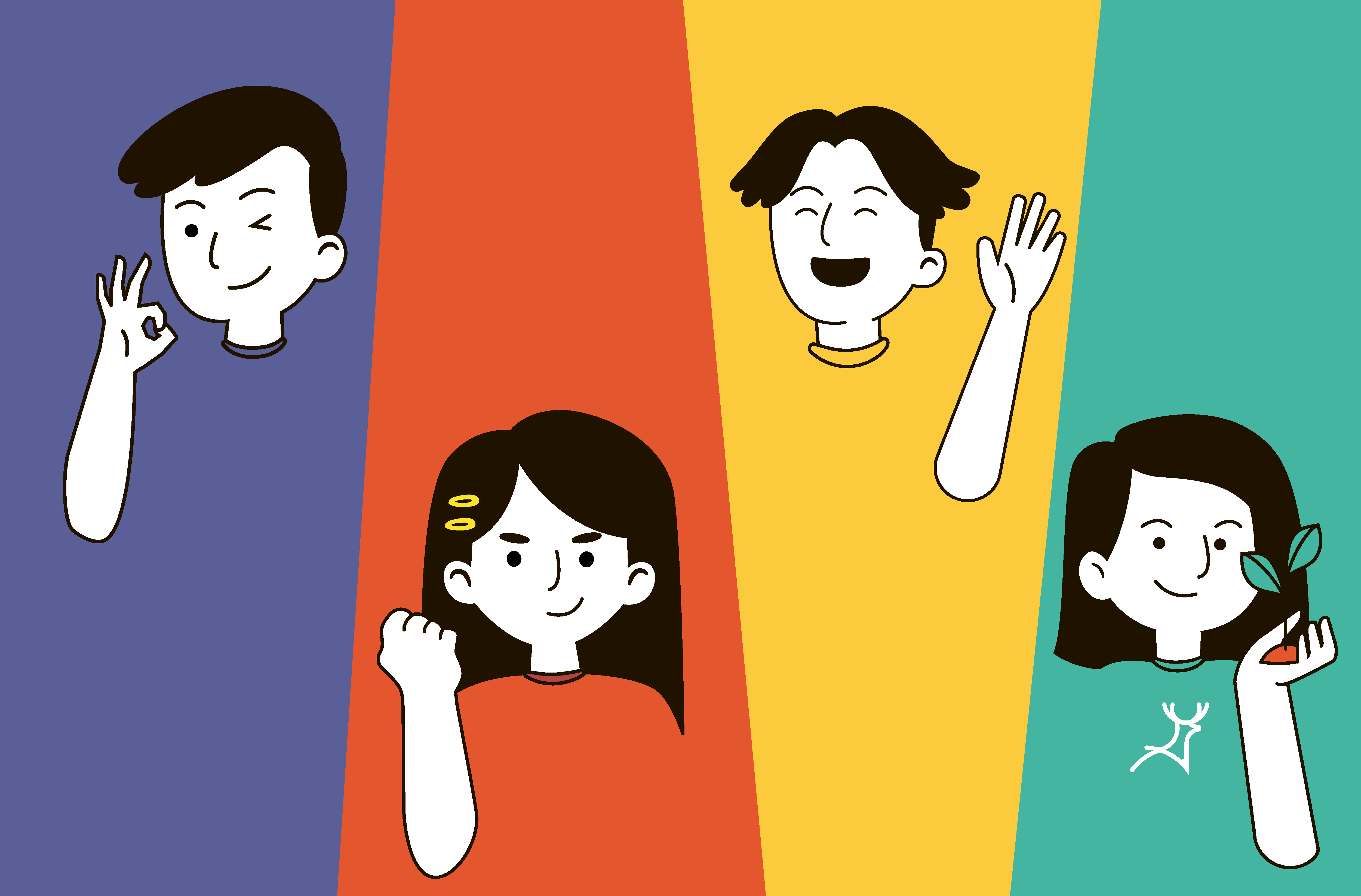
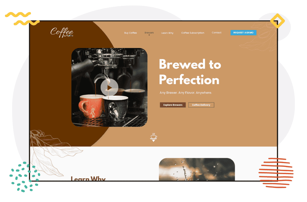
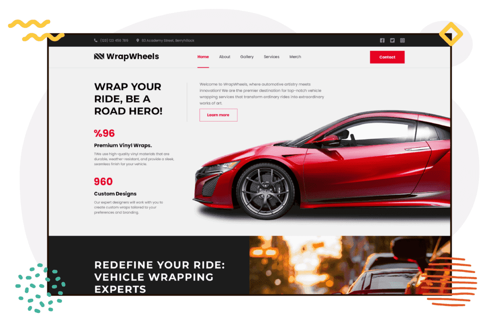
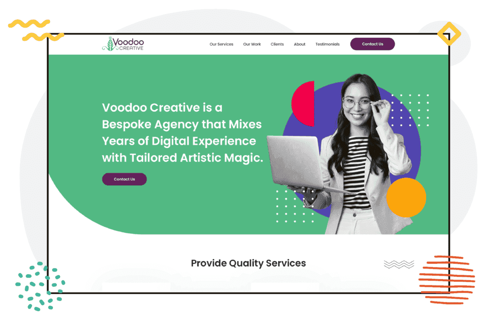
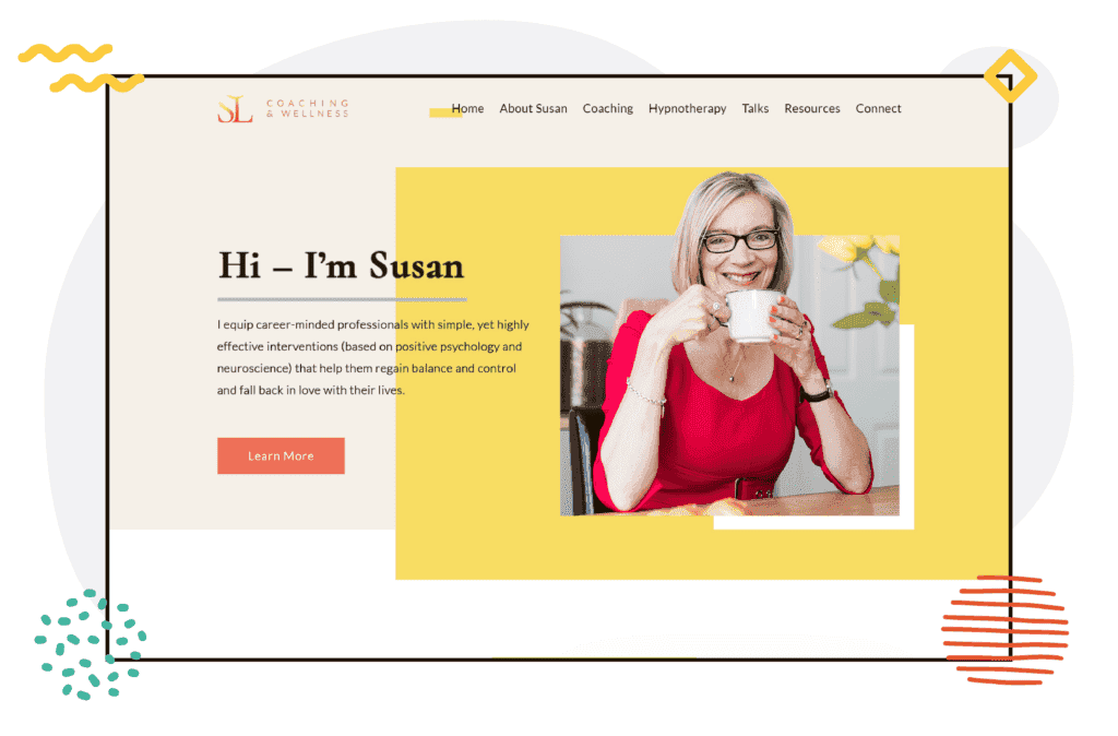
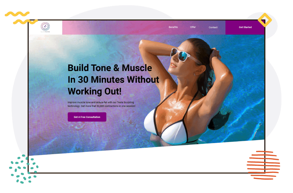
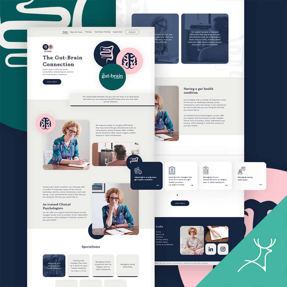
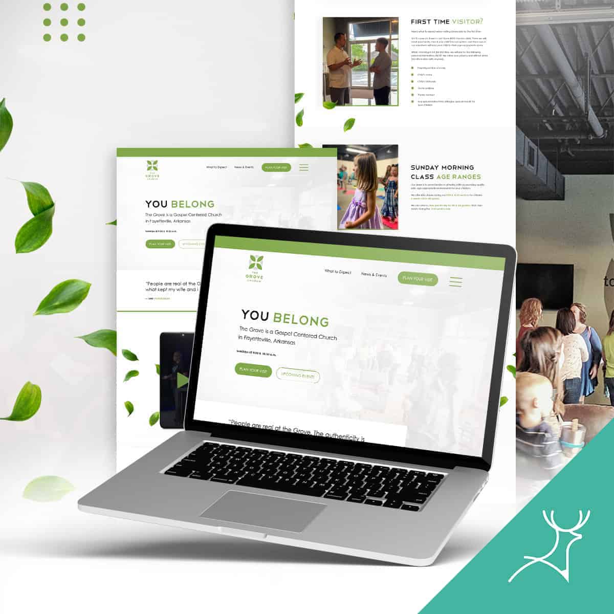
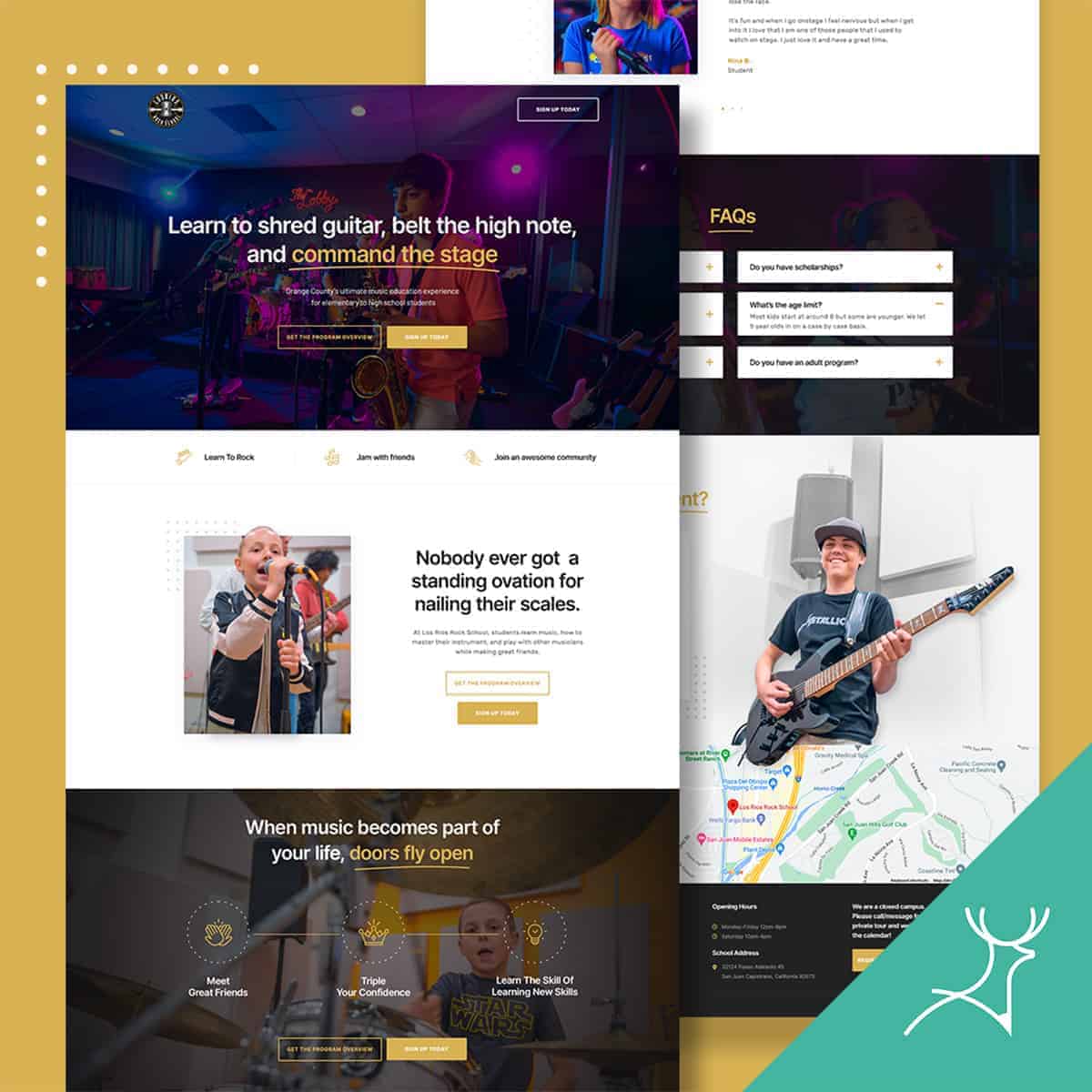
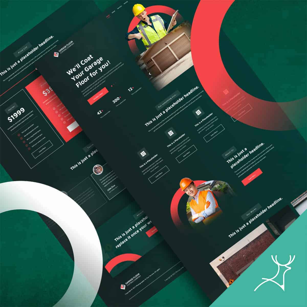
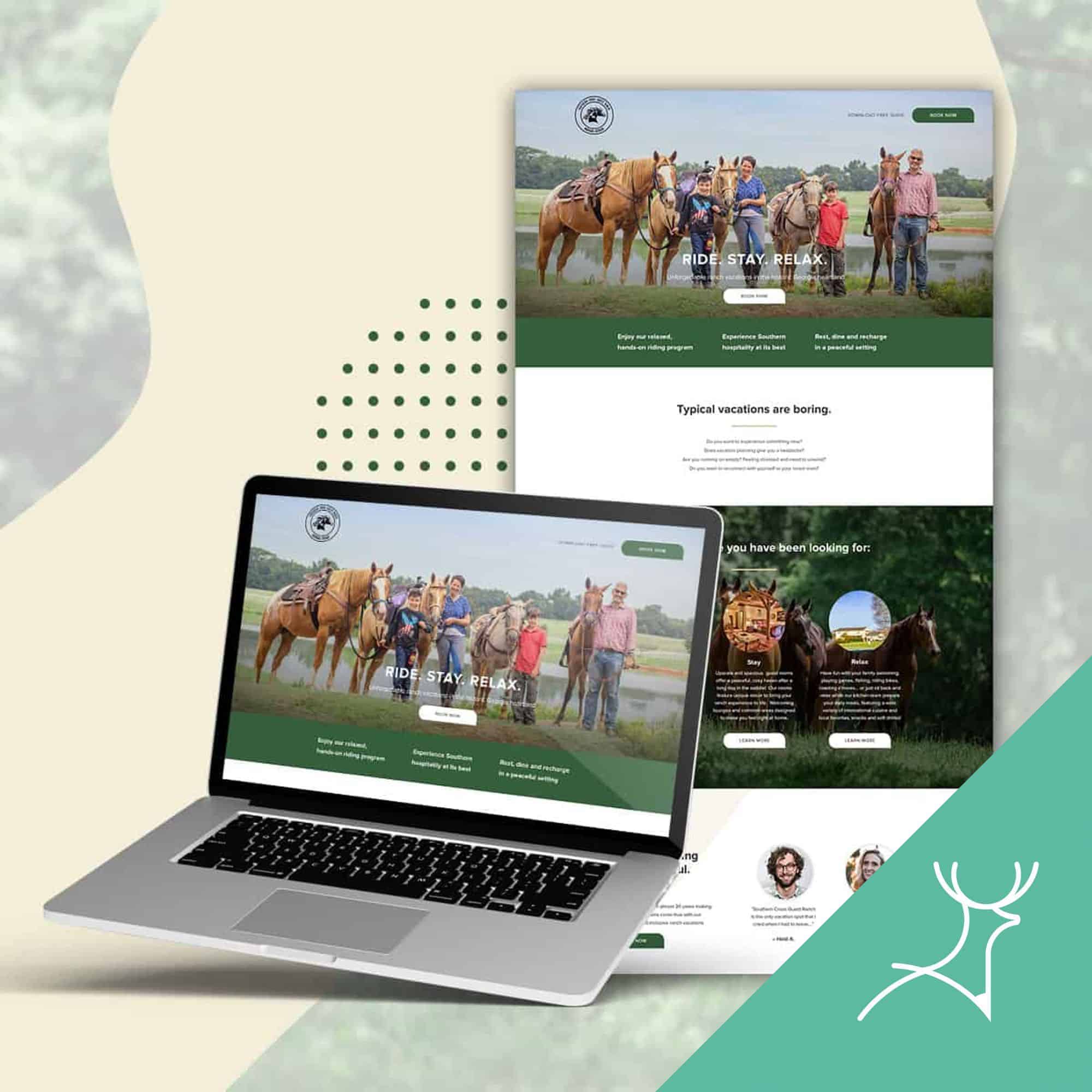
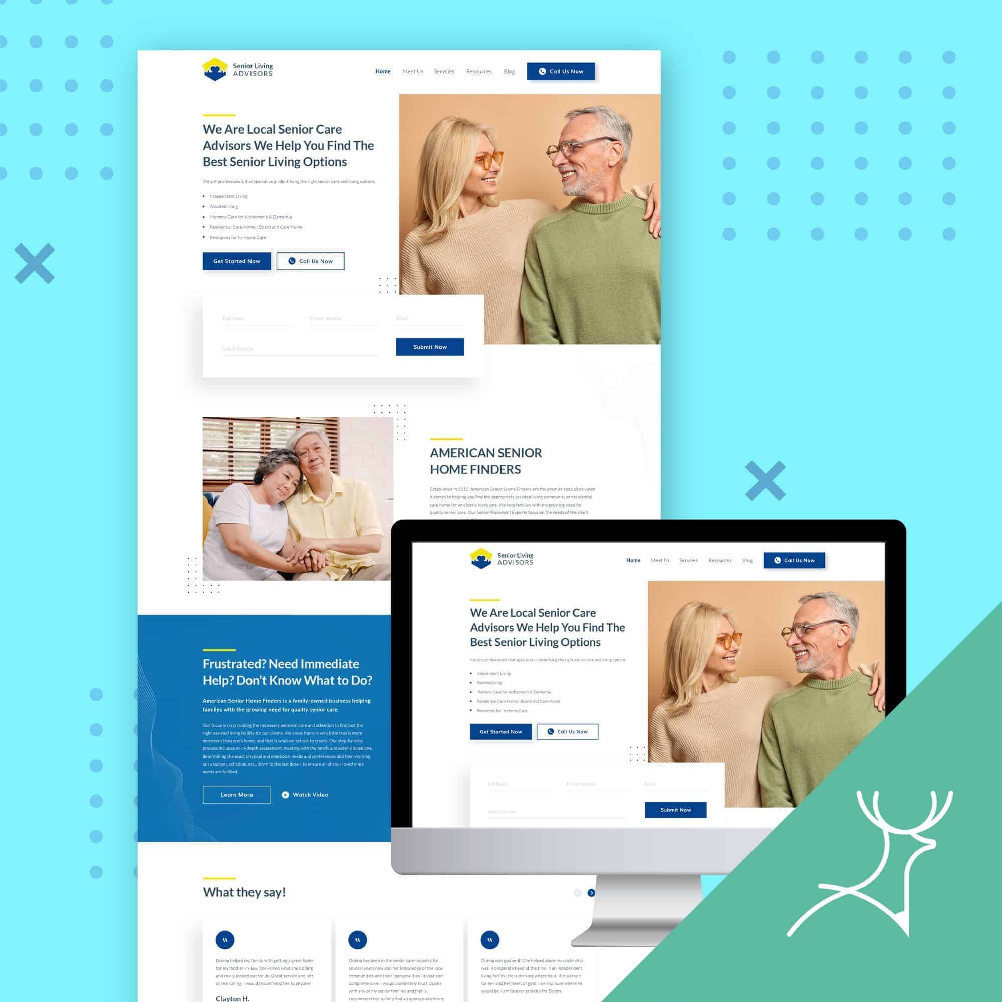
Let’s play a bit with the themes.
If you look at the designs below, you will see that even if the website hero sections have the basic elements like image, headline and buttons, they differ in brand personality so the colors are all totally different.
Swipe ‘em to see or tap the arrows to see more!
Creating emotional impact
Colors can pull some emotional strings and guide user interactions like magic.
Calls to Action: Want those buttons to pop? Use contrasting colors to make ’em stand out and get more clicks!
Background and Text: We don’t want our users squinting. So, let’s make sure the background and text have enough contrast for easy reading.
Brand Recognition: Keeping the brand’s primary colors consistent across the website is the way to go! It helps people remember and recognize the brand easily.
Color combinations and harmony
This is where we become color maestros! Mixing and matching colors to create a beautiful and harmonious design. Color wheels and complementary colors are our secret tools.
Sample web designs by Deer Designer

Eyes on hue
Knowing the psychology of colors gives us web designers some superpowers. It’s not just about looks, it’s about forging real connections with users.
Plus, you don’t have to rack your brain trying to figure out the best color for your brand and your target audience.
You can ask your Deer Designer team to create variations for you to choose from. They can even create a set of brand guidelines for color usage consistency.
By carefully picking the right color palettes, considering cultural influences, and using colors to evoke emotions, we’ll create web experiences that blow everyone away! So, let’s make the web a colorful, engaging, and unforgettable place!