Designing for conversion: landing page designs that work
You’ve planned your marketing strategy: check ✅
You’re running paid advertising: check ✅
Your social media pages are highly optimized and they are generating natural solid search results: check ✅
A lot of visitors are arriving on your page: check ✅
Any normal person will be satisfied with these numbers, right? But you are no ordinary person. You’re invested in getting quality leads for your product or service.
You look at your most important unit of measurement: the conversion rate.
Landing page sign-ups: Zero. None. Null. Nonexistent.
It is time to panic. Your landing page design is not working on your target audience!
What is the difference between a landing page and a web page?
A landing page is a specific web page developed particularly for a marketing or advertising campaign. It’s where a website visitor “lands” after clicking on a link in an email, an advert, or a social media site.
Unlike website pages where a visitor can click through a lot of options, a specific landing page only has one goal.
A successful landing page will accomplish its goal by persuading a potential consumer that it is worthwhile to submit personal information, or payment, in exchange for your products or services.
With only one shot at convincing your client to sign or pay, there is no room for error in landing page design.

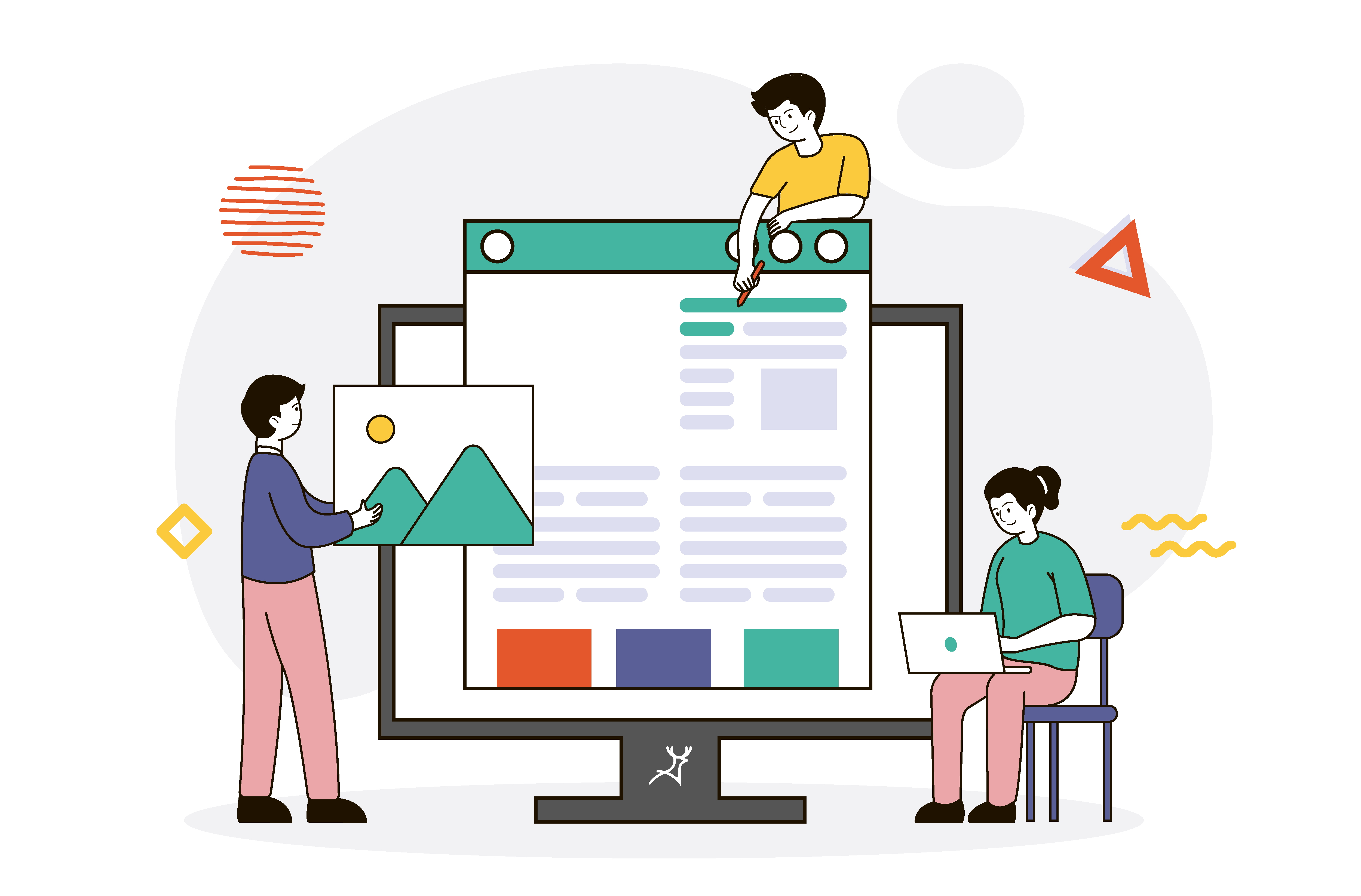
How to make a great landing page design that works
Here are a few suggestions to help you create stunning landing pages that entice consumers to buy your products, get started with your workshops, join your email newsletter and more.
Make an eye-catching hero section
You have less than 10 seconds on average to pique the interest of audiences to your landing page. When you give people an enticing title or banner, they’ll be eager to read the next word, paragraph, and so on.
Put your photo in there (if applicable)
People buy from people, remember?
Hiring a photographer is an option but not required. With any good picture from your mobile phone, Deer Designer can make you look better by cropping out or blurring photo bombers.
Even better, we can change your background so you are standing in a conference room, or by nature, whichever will fit the goal of your landing page.
Use visual cues, let your customer experience your product
Clients can’t directly connect with items when buying online, so they count on your product images to persuade them to buy. As a result, ensure that the picture on your website reflects the quality of the product that your clients are looking at.
Feature images showcasing your freshest products, as well as eye-catching background imagery or fascinating graphics to capture your clients’ interest.
Make use of lifestyle pictures. Lifestyle photos are an excellent approach to communicate the narrative of your product while also assisting your clients in imagining how they may use the product in their daily lives.
Provide specific product details
The more precise you are, the more credible your content will appear to consumers. Landing pages help you sell products by allowing you to emphasize a particular object and convince your clients why they need it.
Include comprehensive product details, and don’t forget to elaborate on essential product characteristics. Tell your consumers what makes your products and services — and your business — unique.
Reviews help you build trust
Clients are more likely to buy from a business that includes social proof. Publishing testimonials on your page increases prospective clients’ trust in their purchasing behaviour and decreases uncertainties, resulting in a greater conversion rate.
Putting social proof on your landing page is a simple technique to broaden your brand’s reach. When clients have nice things to say about a product, they are more inclined to express their opinions on multiple digital platforms.
Do A/B Testing
You’ll never know how well your landing page design works unless you make a comparison.
A/B testing is when you try 2 different versions of a webpage against each other to find out which one works better.
For example, you can test which button colour converts better, or test if an illustration can convert more compared to animation.
Replicating your campaigns is easier if you have multiple versions of your landing page so you can just upload and monitor. Deer Designer can deliver multiple design options for you if that’s the case.
Landing Page Design Examples
Here are a few landing page designs you can get inspiration from. Companies and services differ in branding so let us know if you need yours to be customized for you.
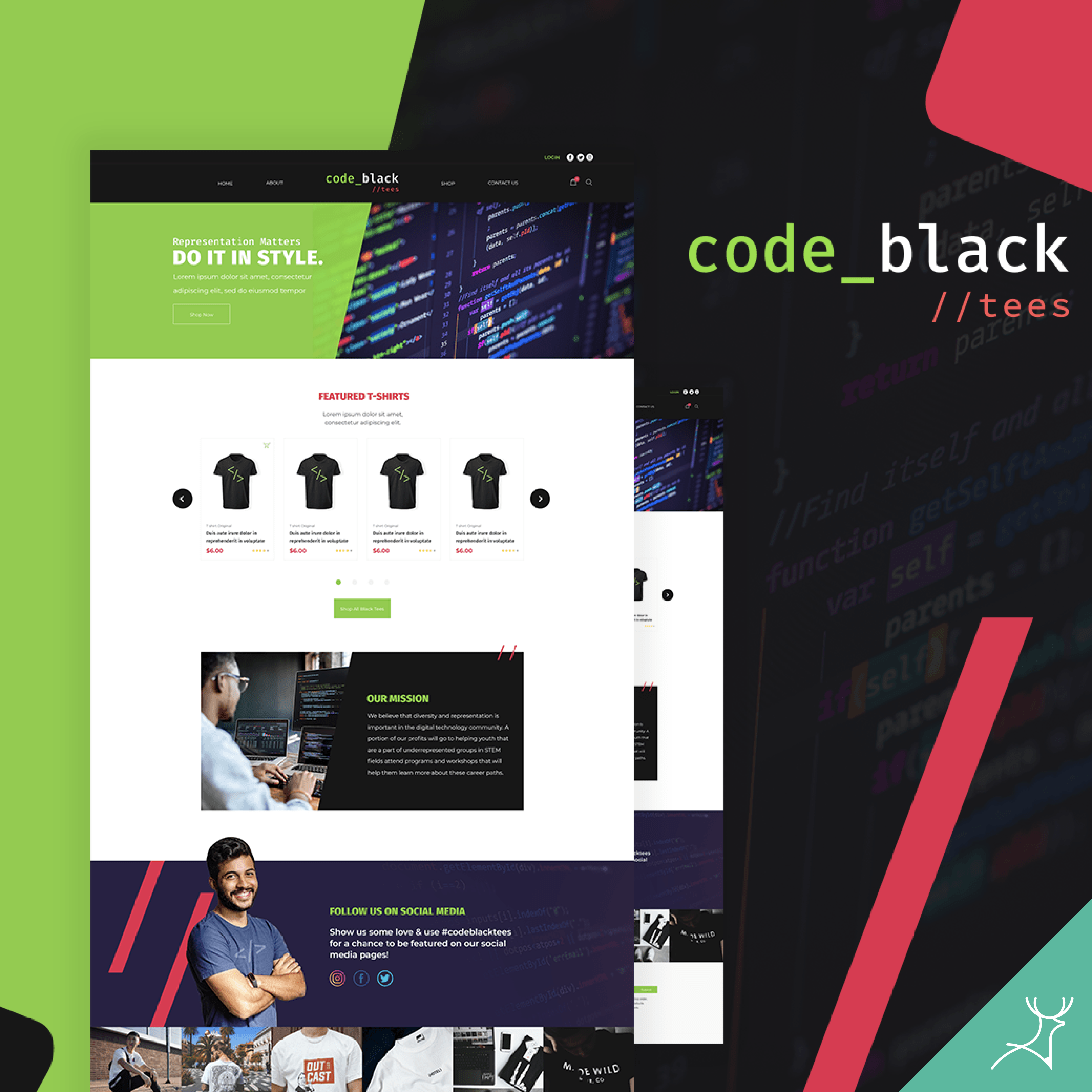
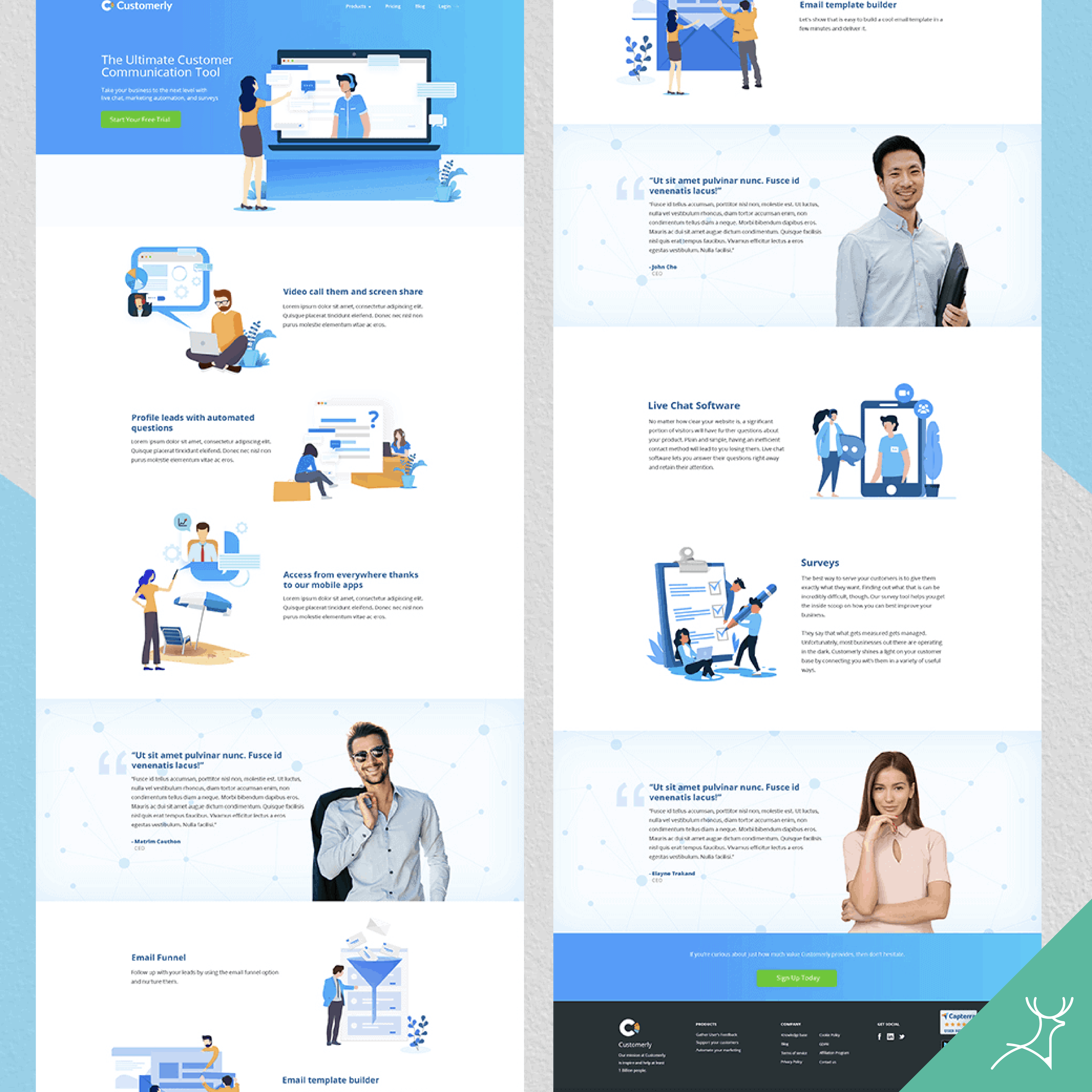
Service landing page design
The Lead Engine
Customerly
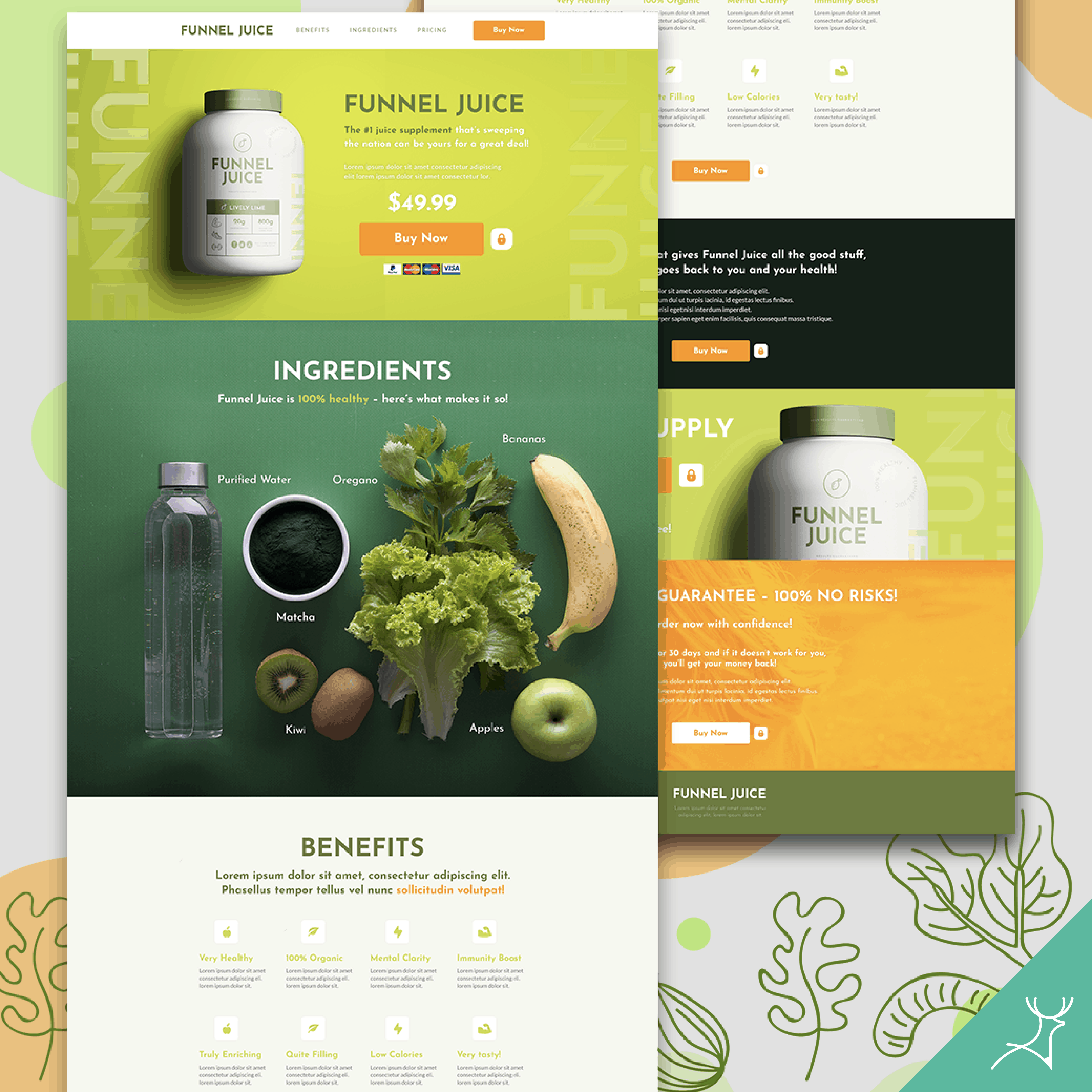
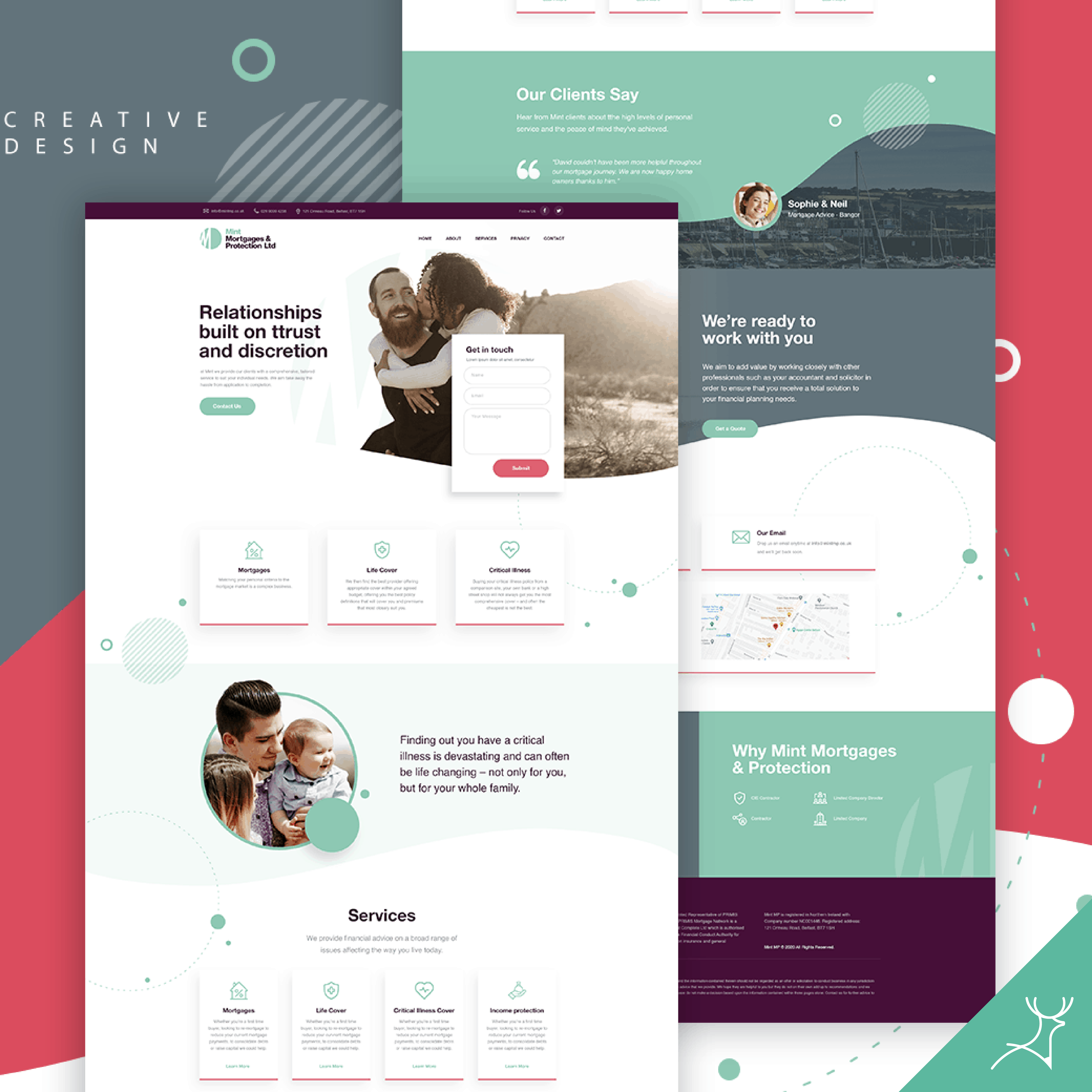
Product landing page design
RJ Smith Creative
Drop Funnels
More design tips for creating a good landing page
Offer value above the fold
“Above the fold” means the section of your landing page that is immediately visible to users as they visit your website.
The landing page structures that convert the most are the ones that keep all of the most important landing page content above the fold.
Keep it distraction-free
When designing your landing page, you need to make sure there are no distractions that will cause users to leave.
For example, if you include a navigation menu on your landing page, visitors can easily click away without opting into your offer. Remember the one action you want your visitors to take and focus on it.
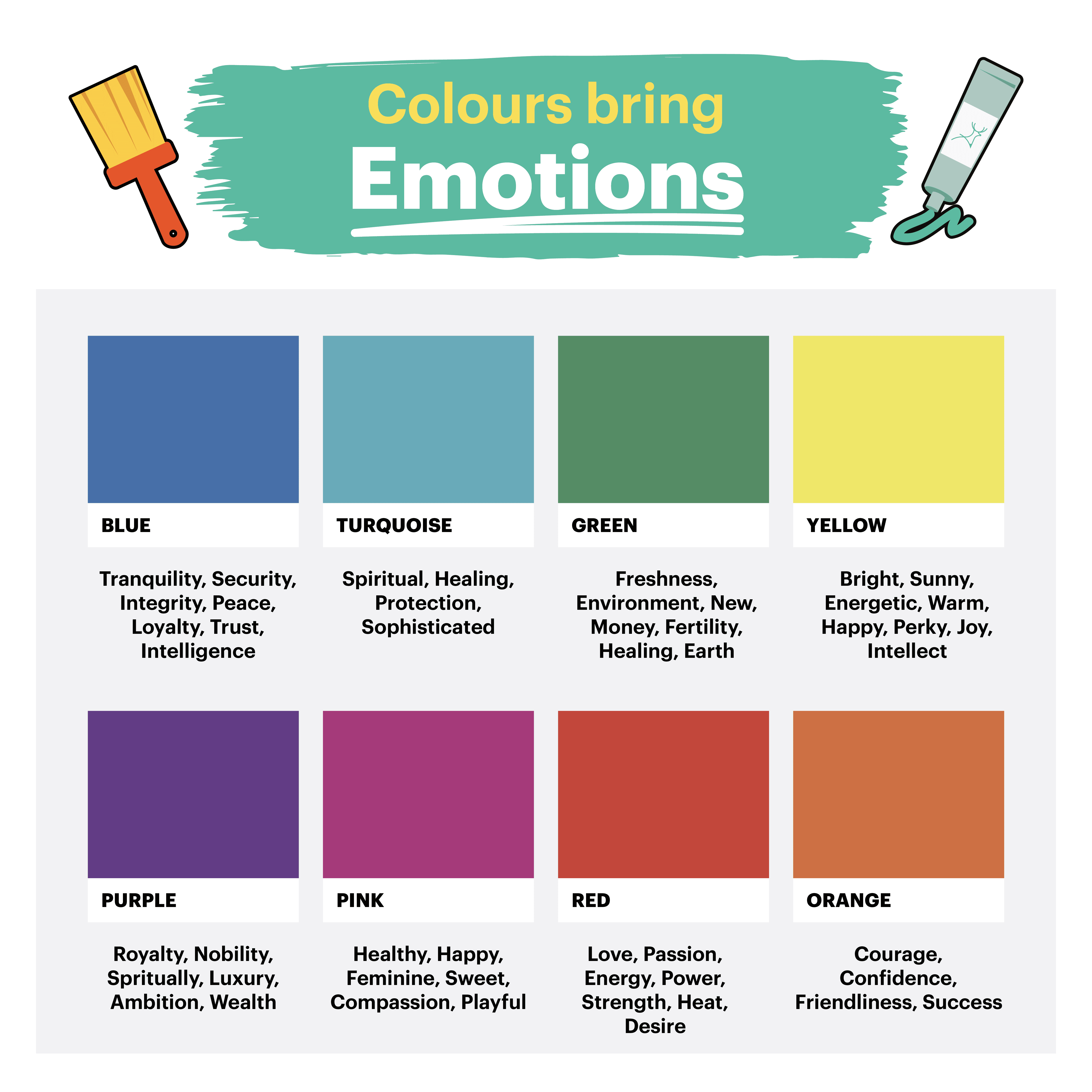
Pick the right colours
Did you know that the colours you choose for your landing page can have an effect on your conversion rates? Well, it does, at least a little bit.
Colour psychology is powerful and people have a natural response to certain hues.
You’re able to evoke specific emotions in your audience and make your landing page more persuasive by considering colour psychology. Why not give it a go?
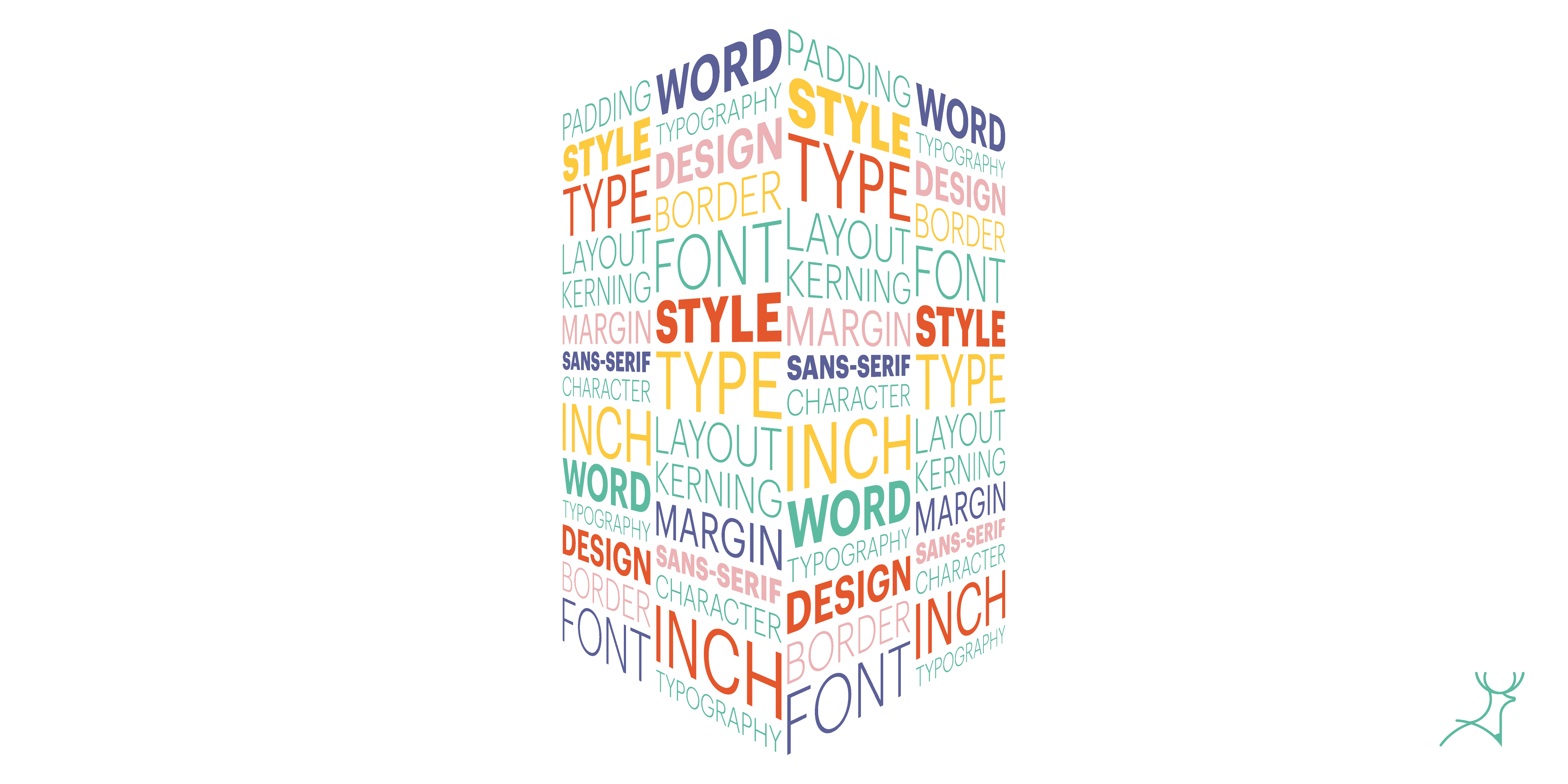
Improve readability with good typography
Fonts can make or break your landing page. While a decorative font might look nice to you, it can actually make your landing page difficult to read and give visitors a poor experience.
Instead, choose a clear, easy-to-read font for your landing page design.
Also, choosing fonts that work well together can be a struggle if you’re not a designer, so its best to have a professional do it.
Landing page design inspiration is one thing, it’s the execution that counts
The ideas mentioned above all have one objective in mind: to get a client to take action once they arrive at your landing page.
Put yourself in your client’s shoes. What do you want to see? Does the page help or confuse you?
The perfect landing page will vary for each company, and yours will be determined by your audience. Learn what your clients want to see, explore alternatives, and try the rest of the suggestions above to get more prospects in no time.