How to make a custom logo design you will be proud of
What’s in an image that makes people stop, think, decide, and act?
And most importantly, how do you pack all those golden characteristics in just one image?
Read on and find out how you can make a custom logo design you will be proud of.
A logo is an image, set of shapes, typeface, or a combination of all three that represents a company, or a product.
Its meaning and application have changed through time, from acronyms on cowhide to a multimillion-dollar asset.
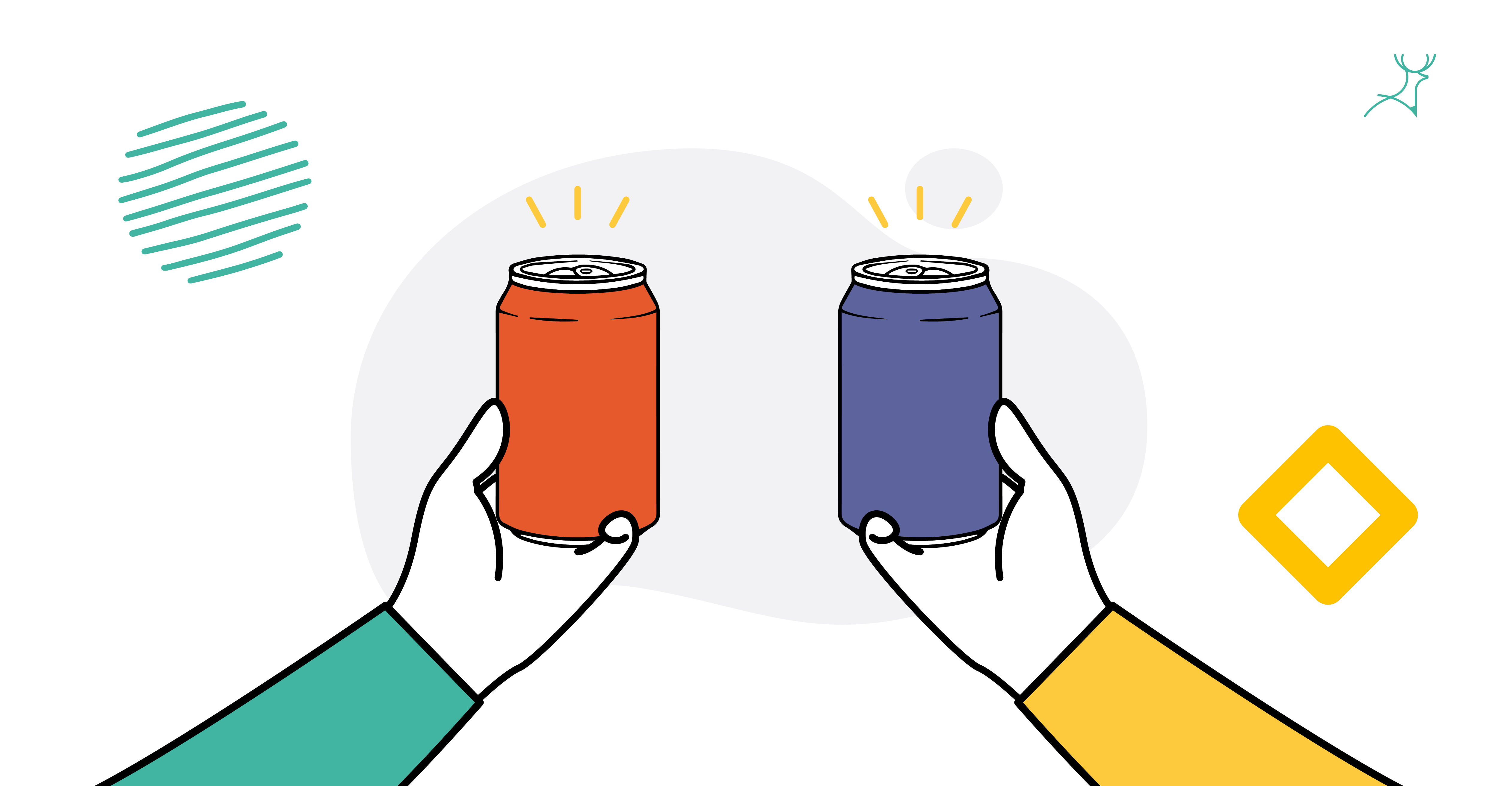
A logo captures the essence of a brand in a single picture, including its origins, the company’s purpose, values, and keywords associated with the brand.
Furthermore, a logo must always establish a personal emotional response from customers because its ultimate goal is to get the customer to remember.
Logos are simply complex.
Because a logo must incorporate complex meanings and messages into one image, three elements must be present:
Colours
The logo must have a colour scheme. These are the primary tone communicators. Is your brand fun? Serious? Or cutting-edge? These may be demonstrated by selecting the right colours for your logo.
Colour is also one of the options to differentiate your brand from competitors.
Choosing colours for your logo
Colour and colour selection have a lot of psychology behind them, and a colour palette can also set the messaging tone. Red stands for excitement, blue shows trust, orange represents fun, brown symbolizes natural, and black depicts prestige.
You don’t need to think of any deep meaning behind your brand’s colour selections. Pick a colour palette that feels right for your business and utilise it to impact website design, advertising, packaging, and so on.
Or even better: get a professional to support you with that.
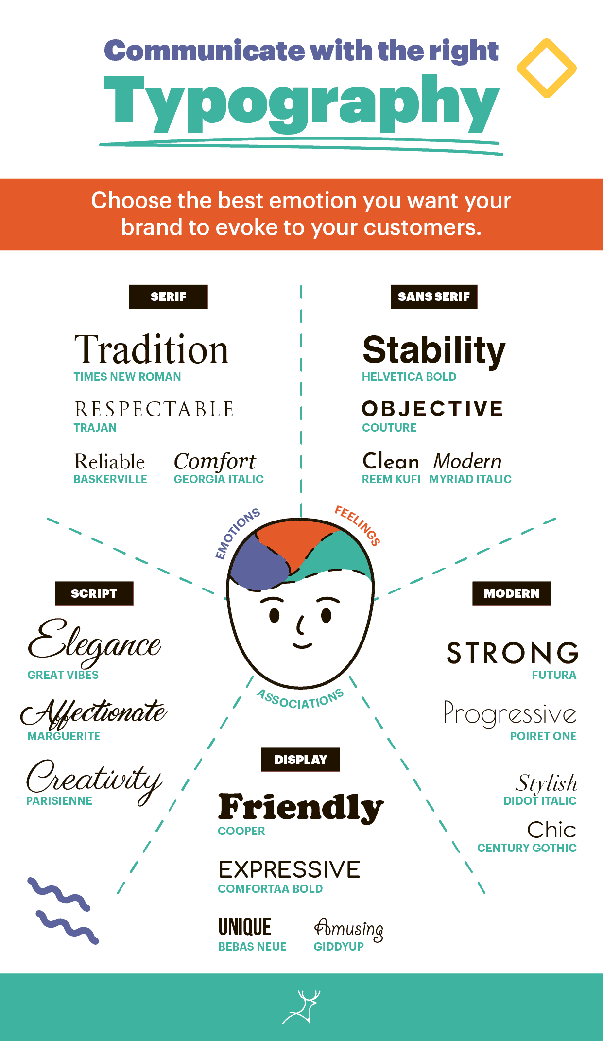
Typography
Typography is a collection of letters that have a consistent design style. Good fonts improve readability, which is essential for customers to remember brands.
There are two types that mainly rely on typography:
Wordmark
Freestanding name or acronym to convey a brand attitude or positioning (e.g.: eBay)
Letterform
Unique design, using one or more letterforms that act as a mnemonic device for the company name (e.g.: M of Mcdonalds)
Choosing a font for your logo
A premium font is an excellent option because it is available in many weights: regular, bold, italic, black, and more. This way, you can use the same font from your branding guide for the rest of your messaging.
Choose a clean typeface that is professionally done and easy to reproduce. If you want your logo to stand the test of time, stay away from trendy typefaces.
Image
A logomark (the icon/picture in the logo) might range from a simple arrow to a stylized orangutan. It symbolizes what you sell or the value your brand stands for.
3 types of logos highlight the use of imagery:
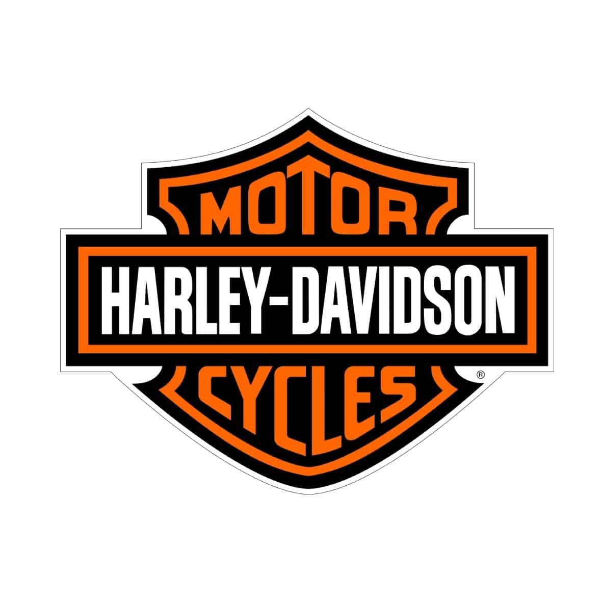
Emblem A mark in which the brand name is connected to a pictorial element (e.g.: Harley Davidson)
Pictorial Mark A recognizable image that has been stylized and simplified (e.g.: Apple)
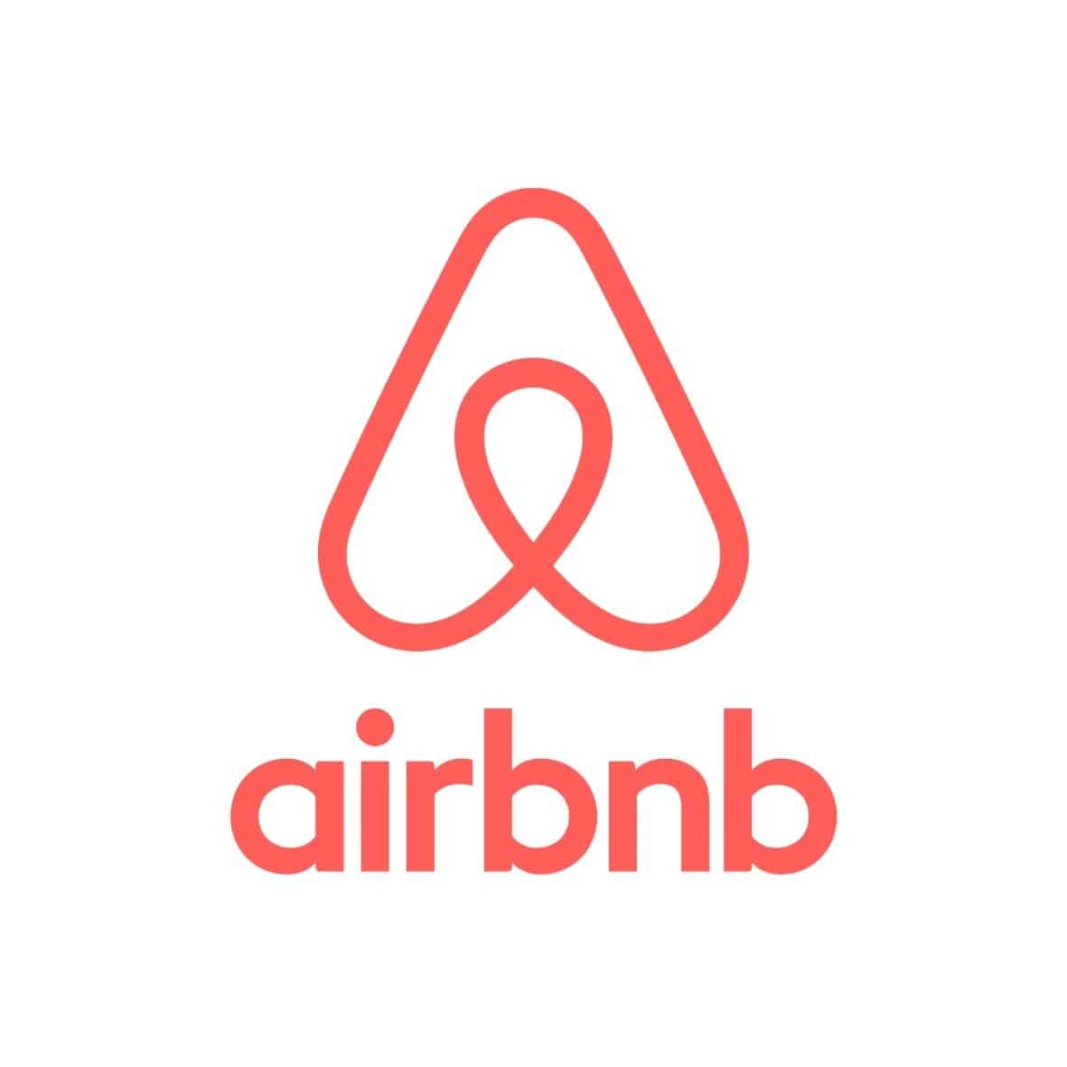
Abstract mark Conveys a big idea, conveys strategic ambiguity (e.g.: Airbnb)

Choosing an image for your logo
This is generally the part of the logo that takes up the most time, thinking, effort and resources.
It’s another component that needs the help of experienced graphic designers because it typically requires the creation of icons from scratch.
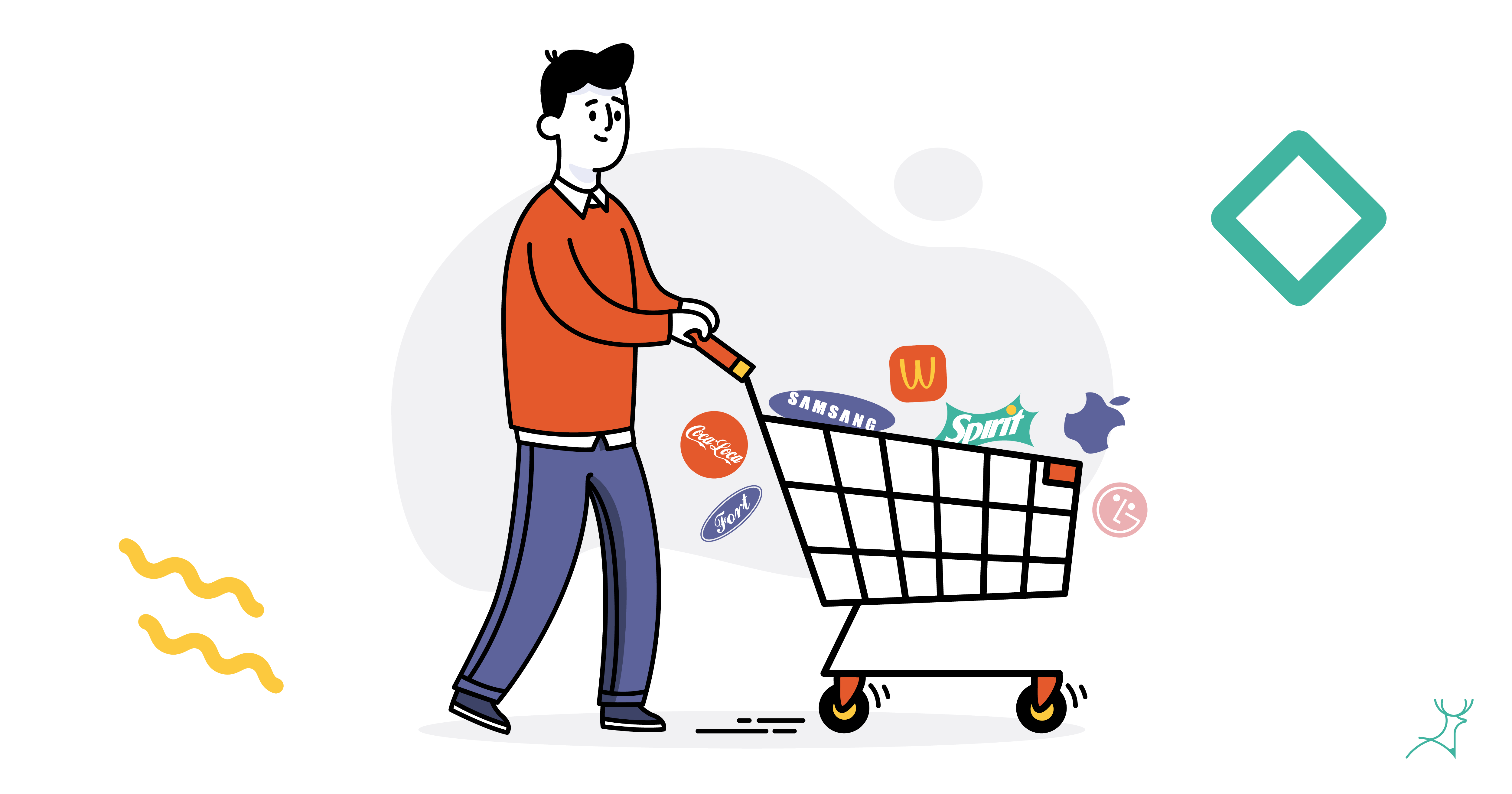
In one logo, the whole brand is reflected. It will be featured in every touchpoint the customer interacts with: posters, letterheads, social media, websites, ads. So, it is necessary that you love your logo and you are proud of it.

That’s a tough order for a symbol to fulfill. And for a good reason.
These are the same reasons why you should stay away from $5 designs.
You can’t be proud of a $5 logo, can you?
Logo design preferences
Creating a logo is a tedious process that requires skill and experience. You’ve gotta have a good eye for all the elements listed above and, on top of that, you need to remember that the logo design must:
- resonate the brand
- be unique (no templates)
- be easily replicable offline and online
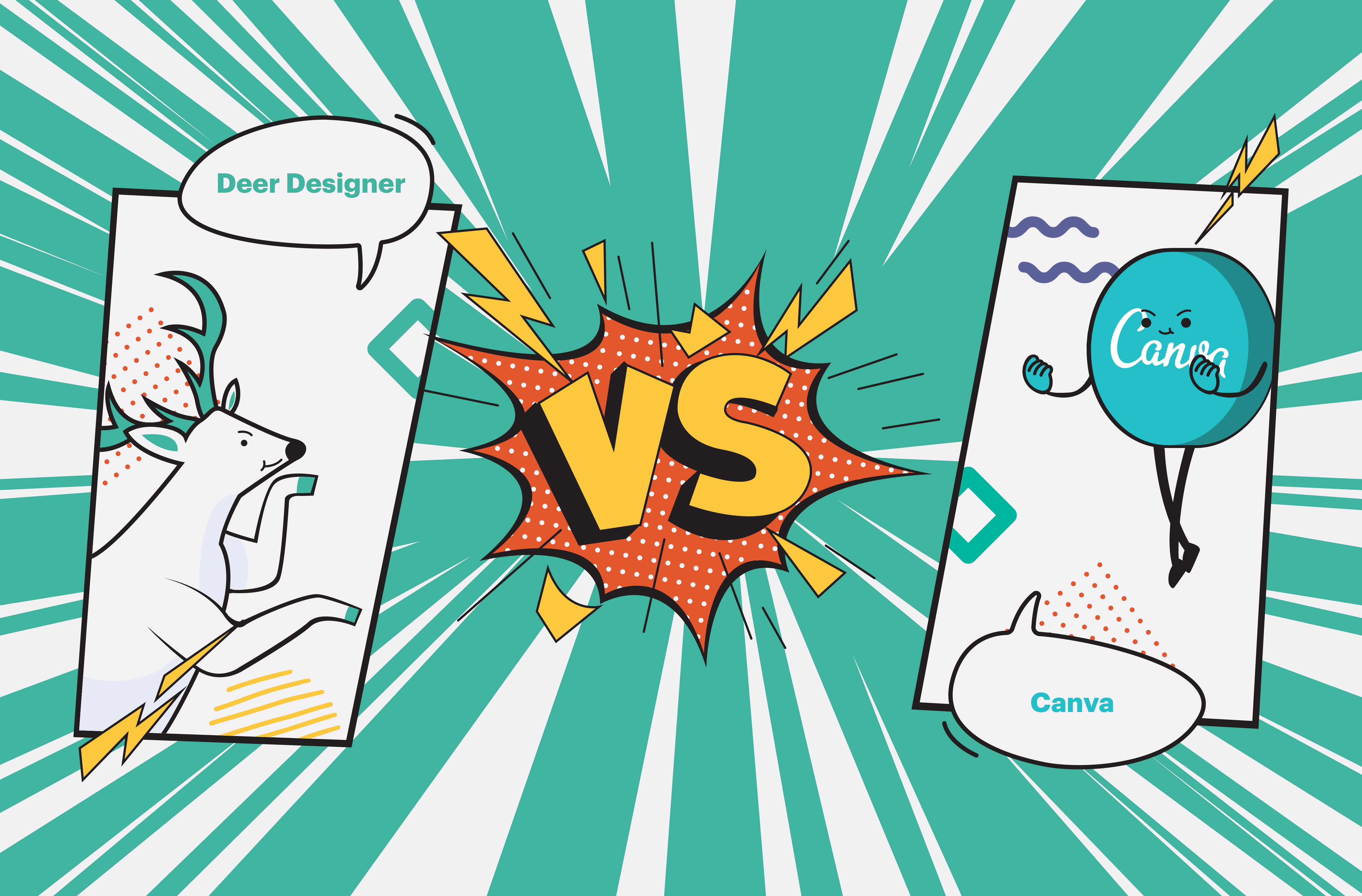
We’ve met many non-designers who created their company logos from scratch by using an online tool or software, (link Canva article) only to be disappointed with the results.
That’s why we recommend hiring a professional design team (cough cough, Deer Designer, cough).
Logo Design Inspiration
Here are a few logos we are proud of having designed for some clients’ clients that made an impact on our clients as well.
![]()
Company: FLOWMOTION LABS
Industry: Computer hardware manufacturing
The client wanted a logo that would appeal to the global corporate world while still being professional and fresh in order to highlight their innovative product offers.
The designer created a flow icon style that shows a slanted letter “F” that, when turned to the side, looks like an inverted letter “M.” To symbolize the Lab, the lettering was mirrored and given a gradient look.
The colour blue was chosen by the designer to represent both technology and science, despite the fact that it was not specified by the client.
![]()
Company: RALPH DAVID
Industry: Construction and Design
Ralph David, the owner, had a serious problem with the logo. Clients and workers called him “David” whenever he wore the official uniform with the logo on the chest since the word “David” was more visible on the previous logo.
He wanted to stay away from the conventional “home builder” look, which is merely a roof or a simple house when designing a new brand.
The designer ensured that the entire name was clearly spelled out. They also customized the initials of the company: “R” and “D” in the design.
A silhouette of a roof or attic was placed to provide depth to the image and highlight the nature of the company.
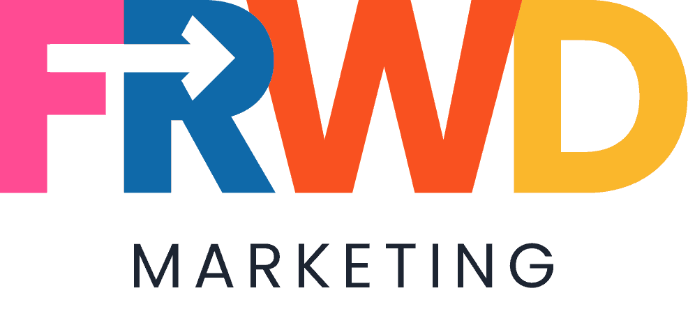
Company: FRWD Marketing
Industry: Marketing Company
The company’s target demographic consists of women who own small or medium-sized businesses. According to their study, the market prefers bright and youthful icons.
The company would also like to keep the original logo’s clean and crisp structure, but with a greater “wow” factor.
The logo designer kept it simple and straightforward to match the brand name. Using negative space, the image of the arrow was strategically placed to be part of the logo. The colour palette used represented a vibrant, young brand.
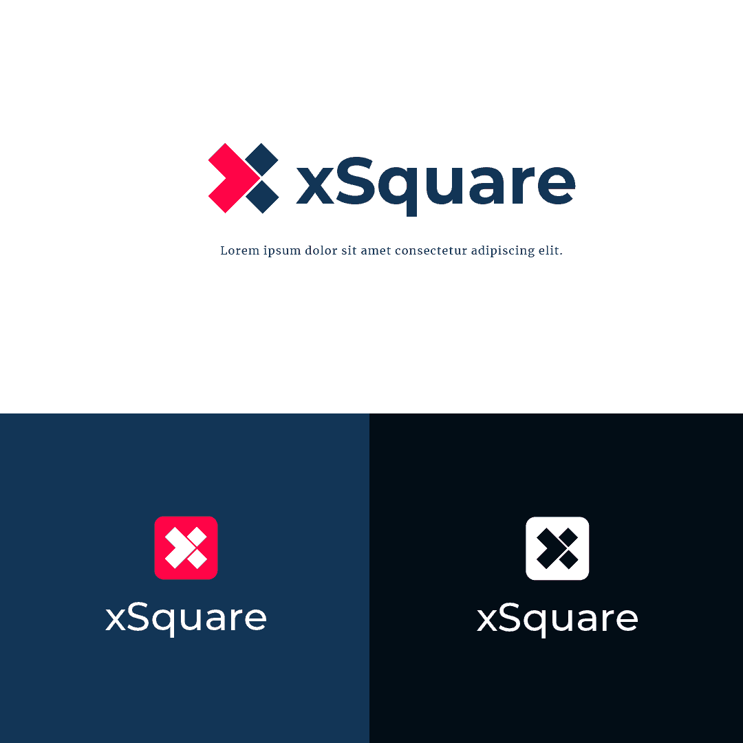
Company: xSquare Web Studio
Industry: Web Design
The client’s priority for the logo redesign was simplicity. One of the most essential reminders was that the logo should look excellent on both dark and light backgrounds.
The logo creator did modify the concept and created a logo that the client loved. They also made sure that the typeface chosen was legible, especially on mobile devices.

Company: Positive Pooch Mooch
Industry: Dog Walking Service
Their former logo looked like it has been hand-drawn by an amateur. It had a picture of a dog placed inside an outline of a paw. It didn’t represent the cheerful service that the company provides.
A joyful puppy was illustrated by the graphic designer and placed above the company’s name. Since the client had not yet decided on a colour scheme, bright hues such as white and green were used.
![]()
Company: Language on the land
Industry: Education
The client wanted a playful, kid-friendly logo for their website. They also wanted a campfire but didn’t want to be associated with camping, so the designer was cautious not to incorporate any additional camping imagery.
The designer went above and beyond to create two logo variations: daytime and nighttime, so the client could see how the campfire might be accentuated in different ways.
Got inspired?
Relax, we gotchu.
Designing a logo is not easy for non-designers. Most of the time, you might have something in mind but you won’t be able to build it perfectly since you lack the time and skills.
If you’re getting your design team to create your logo, here are some tips:
- Be clear about your company’s purpose. Your priorities will shine with the logo you choose
- Check your competitors. The last thing you need is a copyright claim, so be sure it’s not similar to anything else out there. You also want to stand out from the crowd, so look at what may be improved on their logos and learn from there.
- Ask for variations. Try and get at least 3 alternatives because your chosen logo must be perfect for it to stick for many years.