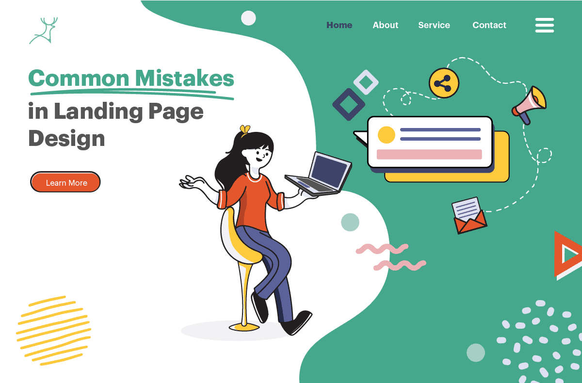
6 Common mistakes in landing page design
I had no idea where to begin when I first tried to create my website years ago. So, like any newbie, I attempted to copy those who were doing well in the blogosphere. I wanted to run a successful blog, so I analysed what others were doing.
I took screenshots of about ten home pages and tried to figure out which layout or colour worked best. The samples were all unique, and as expected, I found no pattern. I ended up settling on a template and a generic-looking blog.
The website failed even before it was launched. What a shame.
I had nothing to lose by shutting down that blog, but it would have been a different story for a company that makes money from its website.
Web design is classified as commercial design, which means it is created not only for aesthetic purposes but also for monetary gain.
The landing page is one of the most important web pages in terms of generating leads and revenue for the company.
Landing page: does it matter?
A landing page is a customised page that focuses on a specific marketing campaign for a specific audience segment.
When someone clicks on a link from an ad, an email, Google, Twitter, or other similar web platforms, they are directed to this page.
The landing page design should be compelling and informative enough to guide the visitor to the next step. A common call to action is to lead visitors to make a purchase or subscribe to emails and company newsletters.
Common landing page design mistakes
A well-designed landing page converts at a rate of 26% on average.
With such a large task resting on a landing page’s shoulders, there are bound to be hard and fast rules for creating an effective landing page. Making one from scratch is not worth the risk.
Designers cannot afford to make a mistake when creating a landing page in today’s competitive world of digital marketing. In business, it’s too high a price to pay.
Share this list with them to ensure that they understand the fundamentals of creating an effective landing page.
Mistake # 1: Unresponsive design
Over 90% of internet users worldwide, or 4.32 billion people, browse the internet using mobile devices. Who wouldn’t want to take advantage of this? As a result, make sure your landing page is user-friendly and mobile-friendly.
Even Neil Patel, a famous digital marketing guru, believes so.
Mistake # 2: Slow to load
The speed of your site is hugely affected by your web host/server, page elements, and design. Have them addressed appropriately.
Remember that 40% of the buying public will not wait more than 3 seconds before leaving a site. Surely, you’d want yours to load faster.
Most visitors will find too many active pop-ups and unnecessary information annoying. They also contribute to lagging, so clear the clutter.
You can also save bandwidth by resizing videos, images, and long texts. Ask your design team about it.
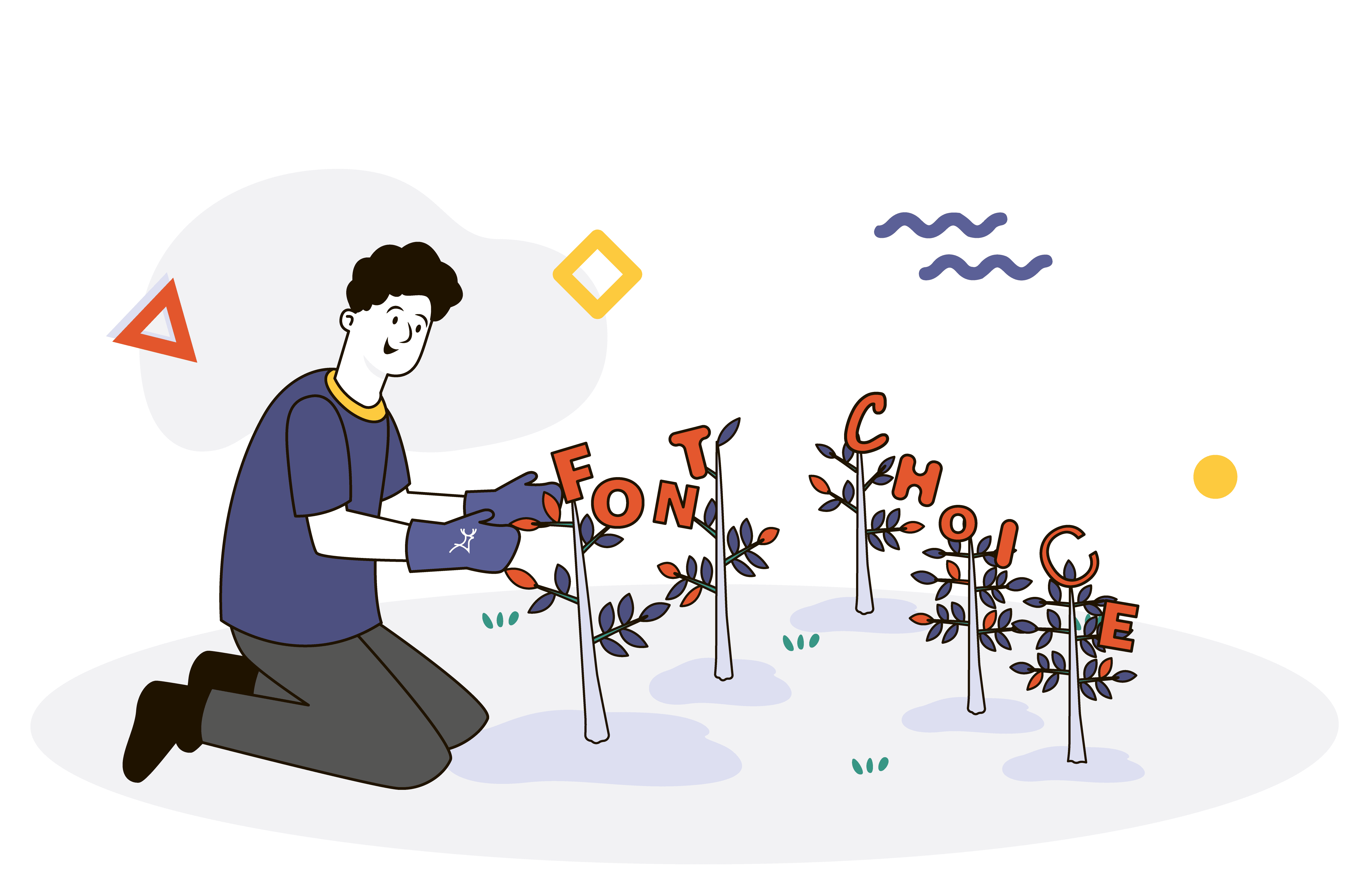
Mistake # 3: Boring headline
Your headline (also known as the title, header, or H1) is the first thing a visitor sees when they land on your page. As a result, it should be succinct, catchy, and compelling.
Here’s a tip: Use numbers in your headline. Numbers help people in determining what you are up to (or what they can expect from you). For example: “Increase your sales by 50% in three days“.
You can clearly outline the benefits that buyers can get from your product or service in the sub-headline. Remember that buyers want to know what’s in it for them, not how cool your product is or if you provide the cheapest service available.
Besides that, by including a time frame, you can make your offer look scarce and urgent. For instance: “Available while stock lasts“, “Offer valid only until Dec 24“.
Mistake # 4: Copy full of errors
A professional will always produce error-free copy. You don’t want clients emailing you about misspellings rather than buying from you, do you? You will not only miss the sale, but it’ll be downright embarrassing!
Before you publish a page, make sure it’s error-free by running it through grammar checkers or having a copywriter proofread it.
Broken links are also considered wasteful errors, so make sure to check and update them as needed.
Mistake # 5: Talking so much about the product
Remember that the hero of the customer journey is the customer. Since the Landing Page is their first stop, it is critical to help them with what they need rather than wasting website real estate droning about technical terms and benefits.
To significantly boost your company’s credibility, make better use of this space by including social proof and unbiased testimonials. After reading credible testimonials, the public’s intent to buy increases by up to 92%.
Mistake # 6: Search engine un-optimized
If this page is linked to a Google Ad, the platform will move it up in the search results if it is not optimised. Although not required for landing pages, it is a wise investment.
Aside from ranking higher in search engines, your target market will relate to what you’re presenting on the page more quickly because they recognise the words you used.
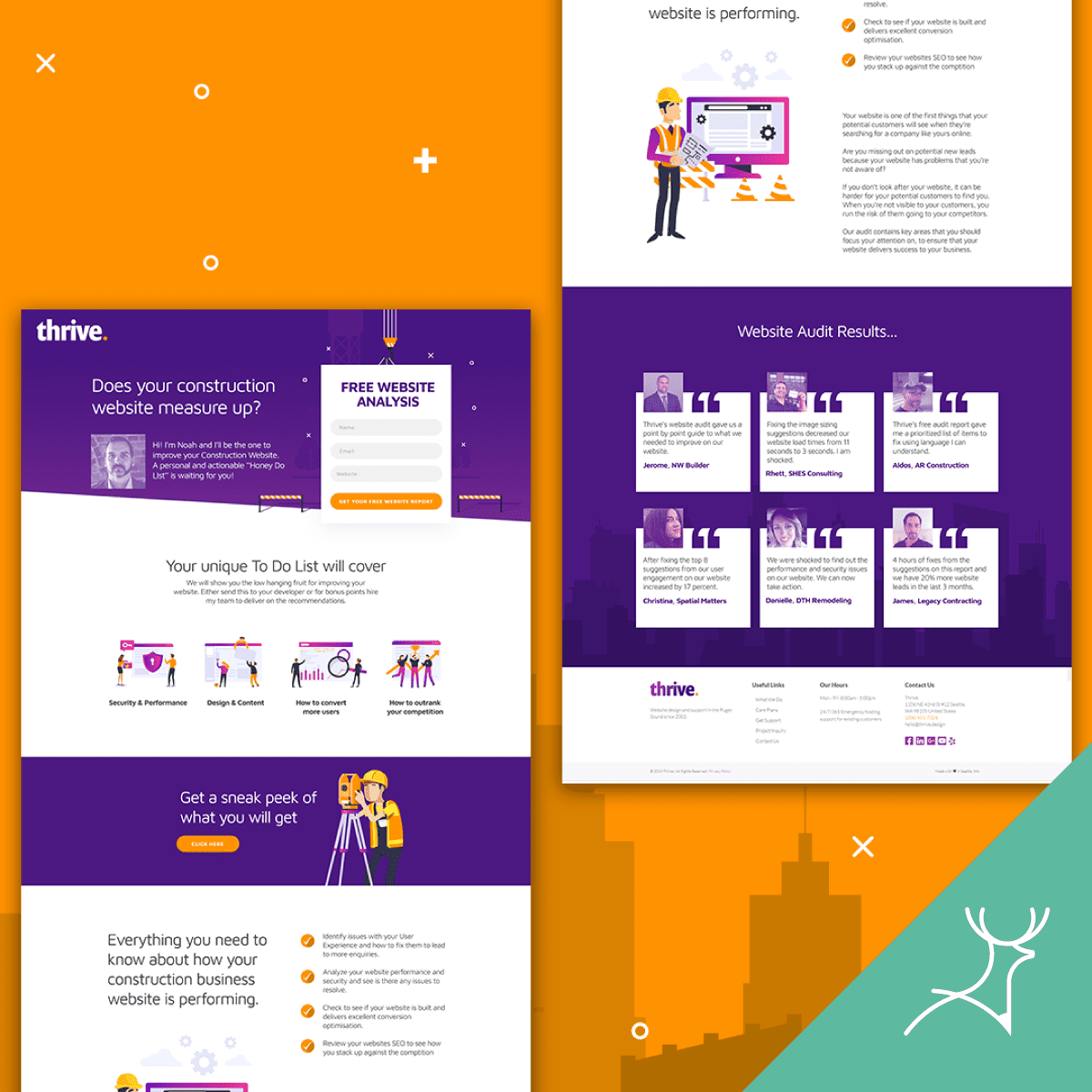
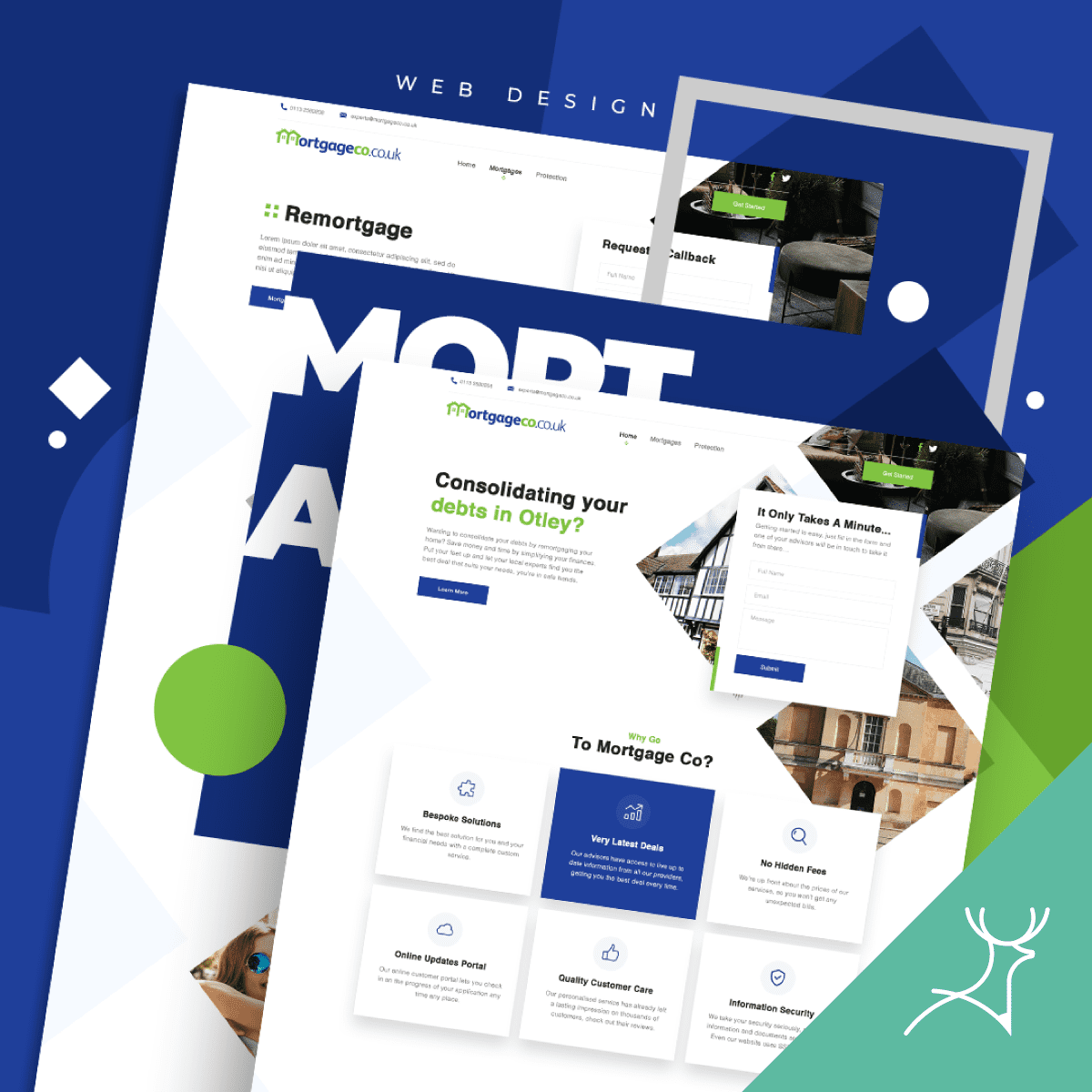
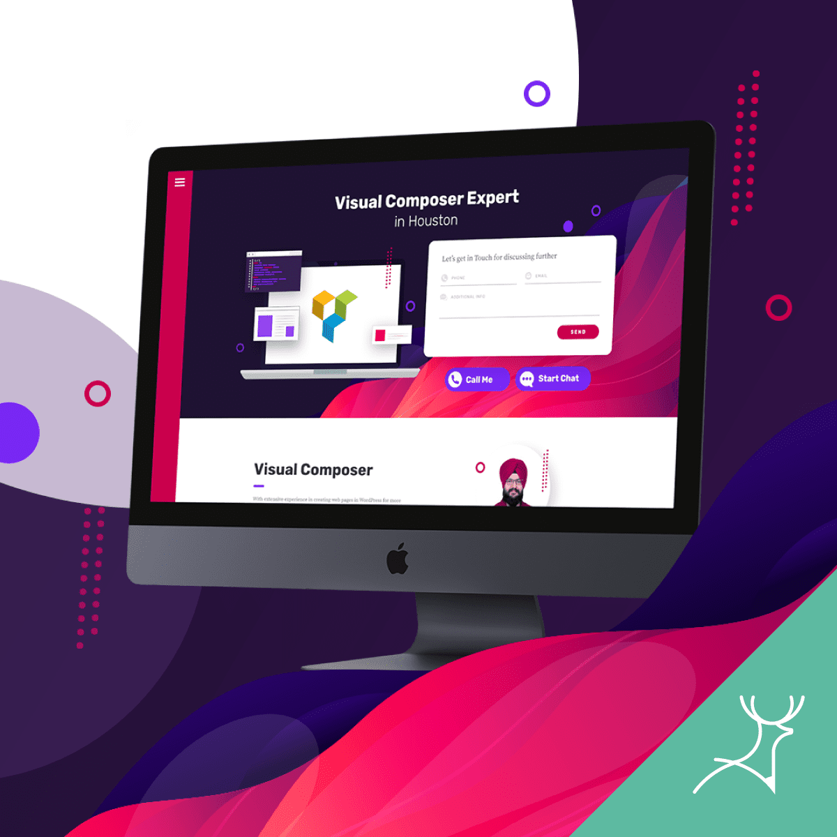
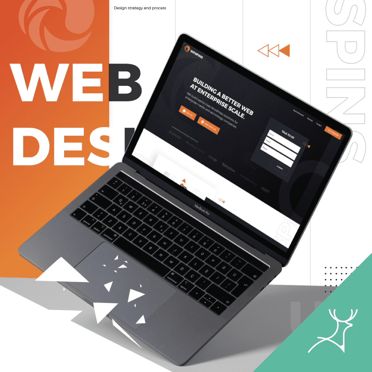
Landing Page Design Samples
Learn from mistakes
To avoid mistakes, as the website owner, you must be aware of the following goals: unoptimized page, lagging, disorganised presentation, broken links, and so on.
With this knowledge, you can also notify your designer of what you want to highlight for your target market.
The most common mistakes in landing page design have been identified and discussed above, along with solutions.
You could always hire a professional designer to help you. As we’ve seen, a well-designed landing page can significantly increase conversions, so it’s important not to neglect it.


