Exploring famous brand logo redesign examples, both the successes and fails

Logo redesigns are a big deal, especially if you’re a big brand and people are so used to seeing your old logo and brand colors.
Even if your brand isn’t that big, people might be more attached to your logo and branding than you might think.
You’d be surprised by the reactions we got from our April Fool’s joke where we mentioned we were rebranding!
Whether it’s a big change in the current logo design or a little logo refresh, revealing a new logo gets people talking, grabs attention, and sparks the imagination.
And sure, it can be refreshing to see brands update their materials from the old to the new and trendier designs.
You get to see a new logo, usually followed by updated colors, design elements, and brand guidelines.
But it can also turn into a massive failure if the new logo design doesn’t match the brand’s identity.
As a designer who loves digging into brand identities and building them, I’m fascinated by the stories and the design process behind these redesigns.
After all, we redesign hundreds of logos for our clients at Deer Designer every week.
So come with me as we look at the most popular logo redesigns, the ones that worked and the ones that didn’t, and how they affect how we see brands.
Why do brands consider a logo redesign?
Before we jump into examples, let’s make it clear why brands decide to update their logos in the first place.
Honestly, there can be several reasons.
They might feel like their logo and branding are starting to get outdated compared to their competitors.
There might be changes going on in the company, and they want a new logo design to reflect that change.
They could also be considering going international, and they want a logo that can grab the international market better.
Do you think it’s time for a logo redesign?
We list some reasons why you might want to update your logo in our article about logo revamps:
➡️Logo ideas for rebranding: When should you revamp your logo?
As a company logo represents your brand, having a more modern logo can help a brand reconnect with people, stand out from the crowd, and remind everyone what they’re all about.
Successful logo redesign examples
Let’s look into the best logo redesigns, the logo redesign process they went through, and why they work.
1. The powerful logo update for Apple
Let’s start with a giant in tech—Apple.
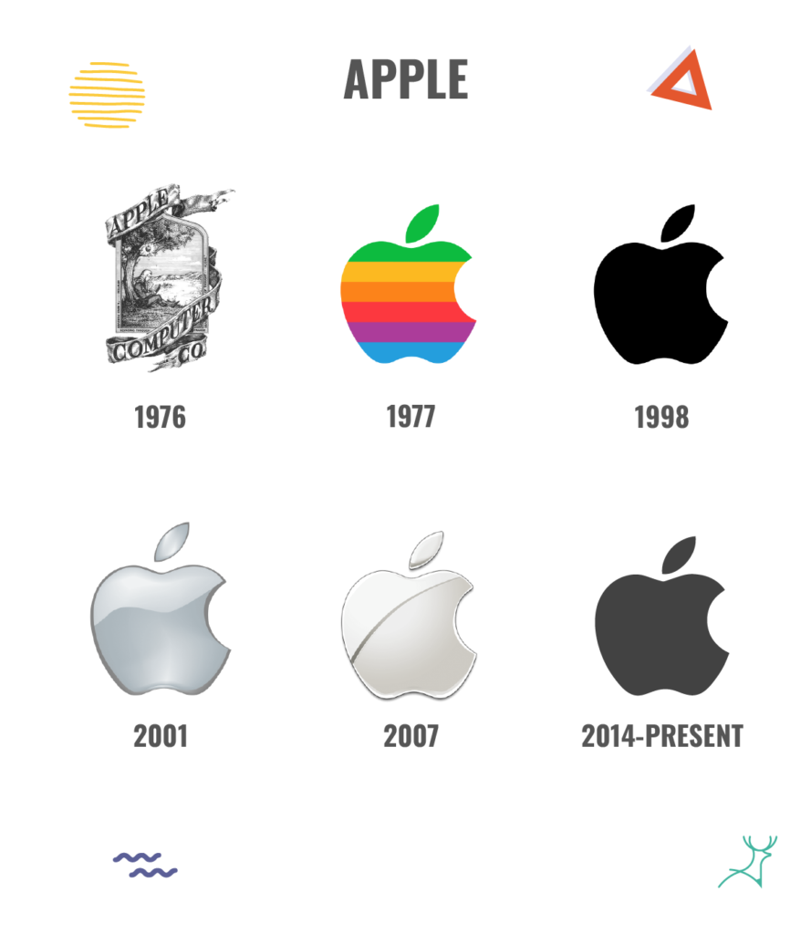
Over the years, Apple has changed its logo several times, each one showing how the company is growing and changing.
One of the biggest changes was in 1998, when Apple introduced a simple apple silhouette with a bite out of it.
They modernized their logo away from the colorful, complicated logos they had before. It matched Apple’s new focus on keeping things simple and stylish.
The result? A timeless symbol that captures what Apple stands for and still connects with people all over the world.
2. Dunkin’ using a simpler logo to expand its audience
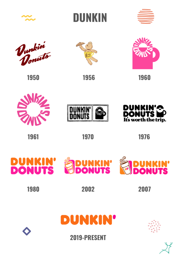
Dunkin’, the beloved coffee and donut chain, made people talk with its massive logo redesign in 2019.
Although they have had several full redesigns of their logo before, the brand has always been known as Dunkin Donuts.
That was until they decided to drop the word “donuts” from its name and go by “dunkin'” instead.
They still retained the iconic pink and orange colors and playful font they have been using for 20 years, but it now has a simpler and more minimal look.
This redesign wasn’t just about updating the look—it was about a shift in focus from just donuts and coffee to a broader range of beverages and snacks.
The new logo retained the brand’s signature colors and energy while also expanding its appeal to a broader audience.
It tells customers that Dunkin’ is more than just a donut shop—it’s a destination for quality coffee, refreshing beverages, and tasty treats on the go.
The logo redesign also reinforced Dunkin’s position as a forward-thinking brand that listens to its customers and adapts to their changing needs and preferences.
3. The easily recognizable logo of Starbucks
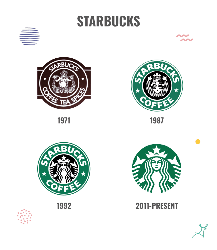
Another success story is Starbucks’ logo change in 2011.
Most of us recognize the Starbucks logo with the mermaid.
But in 2011, Starbucks decided to take the brand name out of the logo.
They wanted to make it simpler and easier to recognize, no matter where you are.
By making the updated logo simpler, Starbucks made it easier for people all over the world to connect with the brand, even if they don’t speak the same language.
The new brand logo resonates better with different cultures as the brand pushes to go international.
Without the bulky green border of before, the logo is easily adaptable to modern store layouts.
That’s a far cry from the previous logo, which fits better with the Western and American brick-style coffee shops exclusively.
4. The major logo change for Airbnb
This is definitely one of the more drastic and risky ways to redesign a logo.
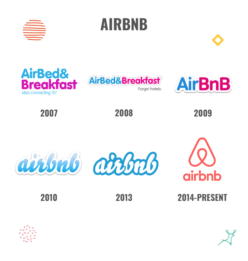
Airbnb, the big hospitality company, changed its logo in 2014 to make it look more modern and friendly.
The previous logo included the words “Air Bed & Breakfast” written in blue and pink. They later changed it to AirBnB written in the same colors.
But it wasn’t easy to use in different places and designs.
The new logo is called the “Bélo.”
It’s a simple design that looks like a heart, a house, and the letter “A” combined.
Airbnb wanted the new logo to show that it’s a place where everyone belongs and feels welcome.
While the new logo received mixed reactions initially, with some critics comparing it to anatomical parts or abstract symbols, Airbnb’s strategic rollout and storytelling efforts helped contextualize the design and build acceptance.
By aligning the redesign with a broader rebranding initiative centered around the concept of “Belong Anywhere,” Airbnb successfully transformed its logo into a powerful symbol of connection and belonging.
Unsuccessful logo redesigns that forgot their original brand identity
While successful logo redesigns can help your brand scale and expand, there have been several failed attempts.
For every triumph, there are cautionary tales of redesigns gone wrong.
This goes to show that there is a fine line between updating your brand’s outdated logo and completely losing your brand’s identity.
Here are some brands that hurt their image by trying to update their existing logo.
1. Gap
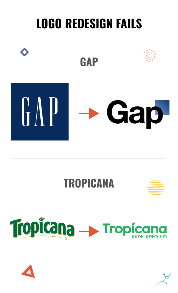
Gap’s redesign is often used as a prime example of a major logo redesign failure.
In 2010, Gap, the clothing store, created a logo that tried to match the design trends of the time.
But the proposed new logo did not click with its audience at all.
It got rid of their classic blue box logo in favor of a bland, Helvetica-based design.
Gap faced immediate backlash from loyal customers and design enthusiasts.
The new logo lacked the warmth, personality, and heritage of the previous design.
It alienated their long-time fans and affected the brand’s image.
After just one week, Gap reverted to its original logo and scrapped the redesign.
This shows the importance of knowing your brand before pushing for a redesign.
It will not work without authenticity and knowing your brand’s heritage.
Think of the parts of your brand that people love.
2. Tropicana
In 2009, Tropicana made headlines for all the wrong reasons with a horrible logo redesign. They changed from a bright, colorful design to something plain and boring.
They replaced their original vibrant and dimensional logo with a more sterile generic design that didn’t resonate with consumers.
Instead of standing out among its competitors, Tropicana just blended in and looked like a startup beverage brand instead.
Within months, Tropicana reverted to its original packaging, but not before suffering losses in sales and brand trust.
The importance of logos to your brand’s perception
Changing a logo isn’t just about making something look nice.
It can easily affect how people see your brand.
A good logo can make people feel good about a brand, while a bad one can make them feel confused or even angry.
A logo change can make a brand stand out and feel fresh, or it can make it seem like the brand doesn’t know what it’s doing.
That’s why it’s so important to think carefully before making a change.
Here are some of our logo-related articles to help you plan out your logo redesign:
➡️Pro tips for non-designers: creating logos that make an impact
➡️The do’s and don’ts of logo design: 7 mistakes to avoid
➡️To face or not to face: Logo design’s pros and cons
Should you redesign your logo or get a logo refresh?
Logo redesigns are powerful tools that brands can use to improve their brand, stand out from competitors, and connect better with consumers.
Whether it’s a success or a fail, each redesign story offers valuable insights on how you can combine design trends, marketing strategy, and consumer psychology.
As designers, it is our responsibility to approach each redesign with empathy, creativity, and a deep understanding of a brand’s essence.
This way, we can ensure that when we redesign their logo, it leaves a lasting impression on the client and helps the brand move forward into the future.
Whether you’re thinking about changing your logo or just want to make sure it’s the best it can be, we’re here to help.
Let’s work together to make your brand look amazing and connect with people in all the right ways.
Key Takeaways
- There are several reasons why brands do logo redesigns, but they usually involve big changes within the company or its direction in marketing.
- Apple, Dunkin, Starbucks, and Airbnb are great examples of brands that changed their while still retaining their brand identity.
- Gap and Tropicana tried to change their logos to match the trends of the time, but they missed what made the brands charming and appealing.
- As logos represent a brand as a whole, they can greatly affect how consumers perceive your company. A logo redesign is a major decision that should be well thought out.
