6 Common web design problems and solutions
Imagine you’re at a big party.
There are lots of people, and everyone’s trying to get noticed.
That’s kind of like the internet.
Every day, billions of people go online. 5.3 billion people more specifically.
They’re looking for fun stuff, cool things to buy, or answers to their questions.
Now, if you have a website, you might think that the odds are in your favor.
Sorry to say that you’re like anyone else at this party.
You want your audience to notice you and hang out with you.
But here’s the tricky part: people at this internet party don’t stay in one place for long.
They’re always moving, always looking for the next interesting thing.
The average global internet user spends almost 7 hours online each day.
That’s a lot of time to spend on just one thing, don’t you think?
You know how, when you’re flipping through TV channels, you only give each show a few seconds before moving on?
That’s what people do with websites, too.
Most visitors only spend about 47 seconds on a webpage.
That’s not even a minute!
So, how do you get people to stick around? You need to make your website super interesting and easy to use.
That means no crappy, cheap, or mediocre designs are allowed.
Think of it like decorating your house for a party.
You want it to look good and make people feel welcome.
If your website is hard to use or looks boring, people will leave.
It’s like having a party with no music or snacks.
But if your website looks great and works well, people will want to stay.
They might even tell their friends about it!
That’s why good design is so important. It’s not just about making things look pretty.
It’s about making people want to stay and explore.
So, take a good look at your website.
Is it easy to use? Does it look nice? Does it make people want to stay and learn more?
If not, it might be time for a makeover. Remember, on the internet, you only get one chance to make a first impression!
Read on to see if your site has any of these common web design problems and how you can optimize your site for better SEO (search engine optimization) and user experience (UX).
Why should you care about the most common website design problems?
Imagine the ideal customer finally arriving on your site just to see an outdated design with very confusing call-to-action buttons and broken links.
What a waste, right?
Mind you, it takes only 10 seconds for a visitor to bounce off of your webpage.
I remember myself leaving a site faster than that when I clicked on a broken link.
What if you have a bad website design?
Get ready to say goodbye to a potential sale for good.

The fight for people’s attention has gotten fiercer since the birth of the Internet.
Mind you, there are now 1.1 billion websites on the internet and three new websites pop up every second.
Does your site stand a chance against all of this competition?
It’s always a good idea to review your website and see if it presents the common website design problems listed in this article.
Once you can pinpoint these common design issues, you can then go over the potential solutions.
Most of them can be solved with easy fixes, such as:
- Hiring an experienced designer or developer
- Taking stock of the current layout and identifying what needs to be changed
- Keeping things simple so as not to overwhelm visitors
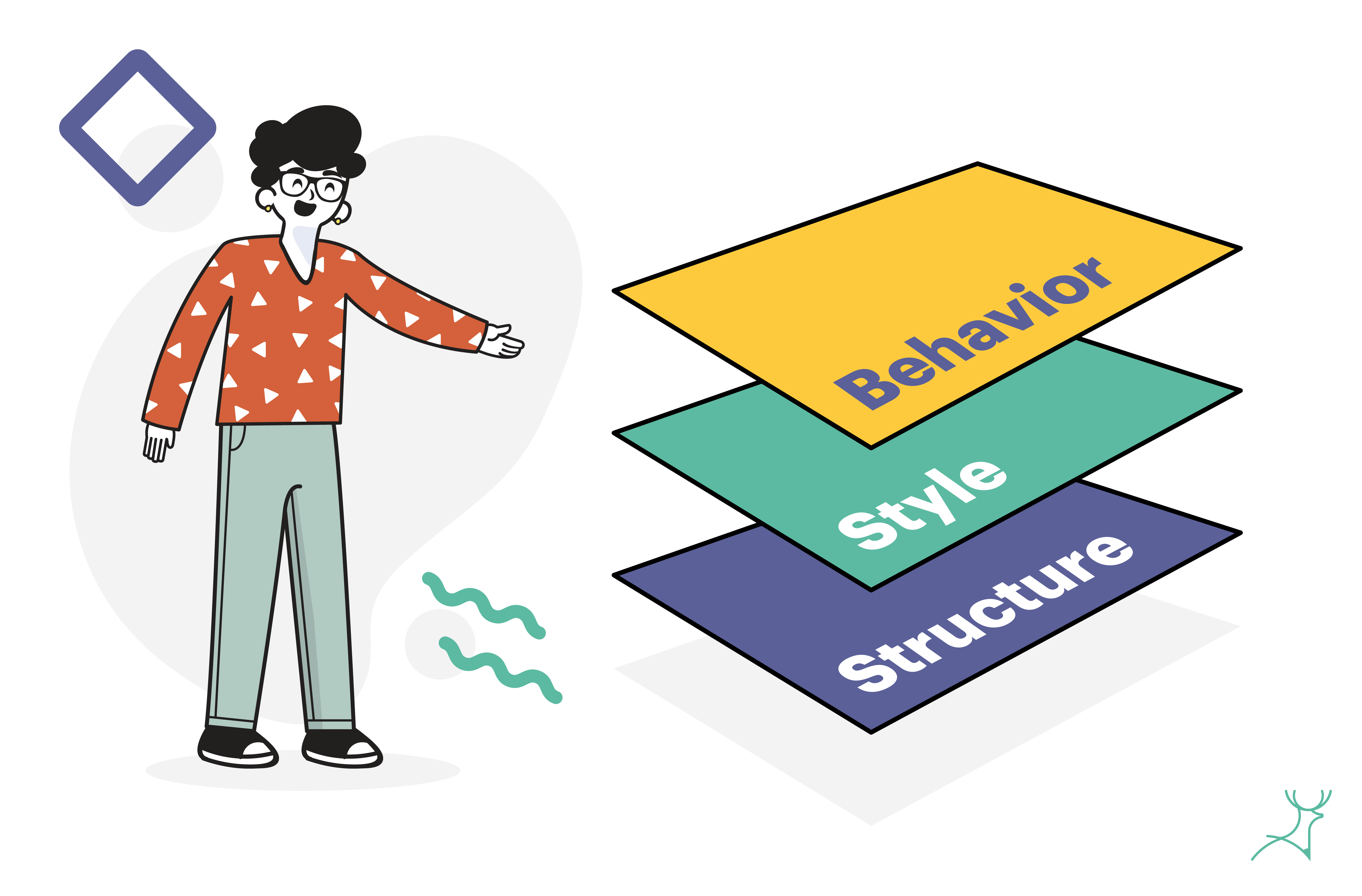
Front-end website development is compared to a three-legged stool by web developers and web designers.
These 3 legs or 3 layers, are:
- Structure
- Style
- Behavior
The design of the website sits in the middle of these layers and, while it is not the only defining factor, not working on it can affect the whole web design project.
Here are some of the common problems you should look out for:
1. Outdated and slow-loading websites
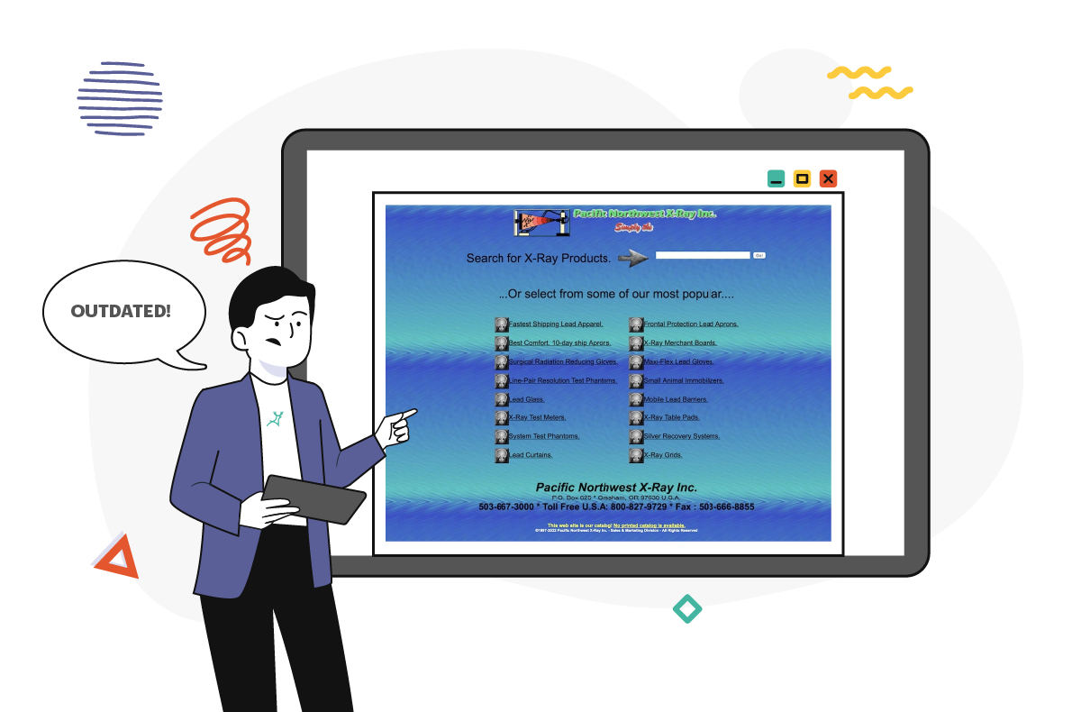
There are ancient websites like these that are still live, but no matter how amusing they look, they do not give a pleasant user experience.
The Solution: Ask your designer for suggestions on how to improve your website.
It might be an overhaul, a simple button, or an image swap.
Whatever it may be, it will do wonders and may increase website traffic.
2. Low-quality and inconsistent content
Compared to handing out brochures and flyers, a client’s website content is going to reach an even wider audience because of the internet.
With that in mind, it’s important to remind your clients to create high-quality and relevant content.
Take note: content is not just the text (what we call “copy”); it also includes imagery or graphics to send the message to the target audience.
Are there pixelated images on the website?
Let’s hope not because they look cheap (unless it is about Minecraft),👾.
Also, are you about to use too many stock images?
The problem with these images is that they’ve become very generic and overused.
It is better to have some custom illustrations or photos to present the website effectively and in a unique way.
The Solution: Hire a designer who can improve the look of your website and also create designs for your clients’ advertising campaigns.
Your clients can get immense value out of this partnership if you offer this service.
Any marketer or salesperson knows that for a brand to stick, the messaging and the content across all platforms must be consistent.
3. Lack of navigation and usability
Think of three websites you commonly visit and you will realize one commonality: they are easy to navigate.

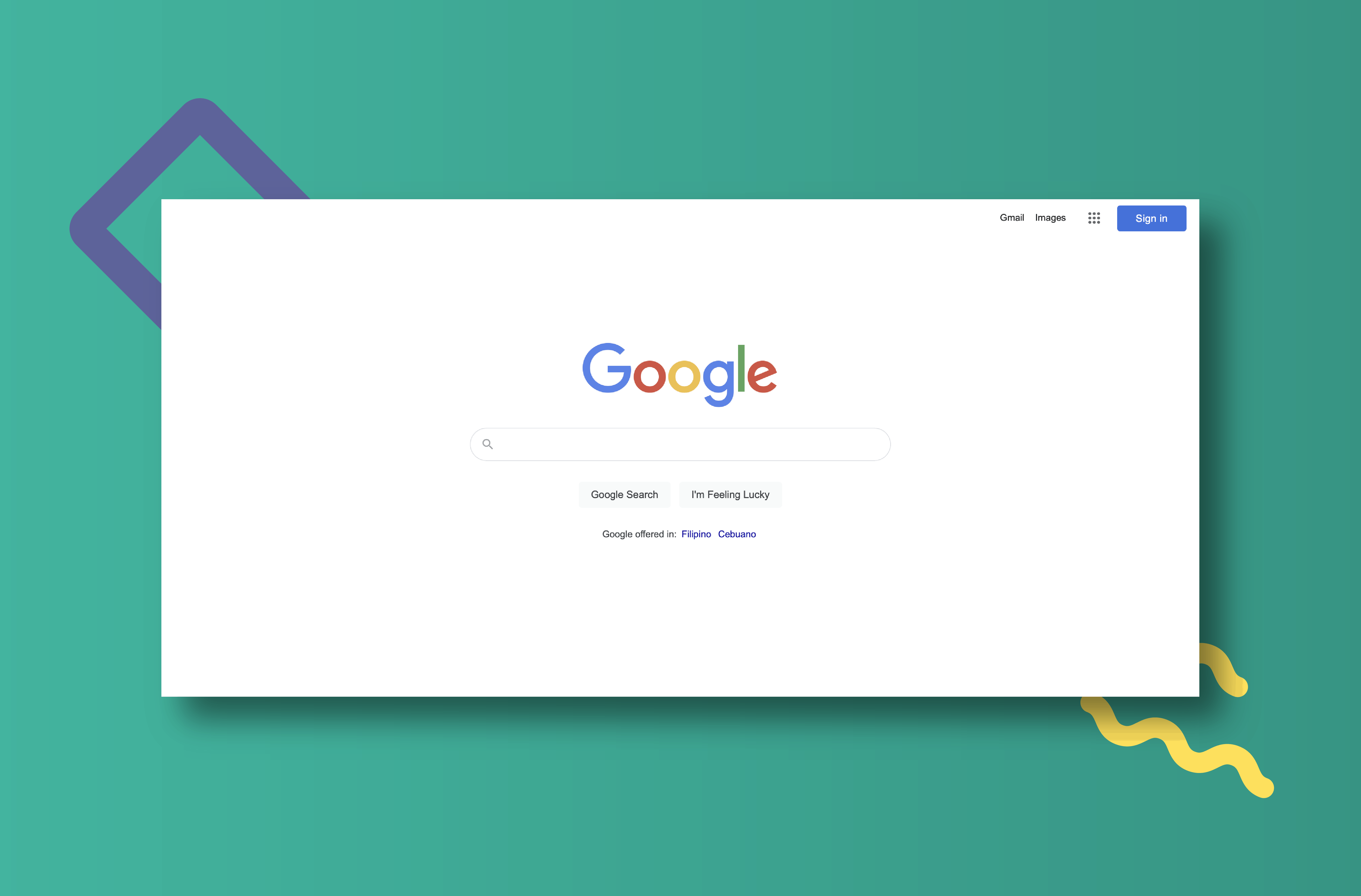
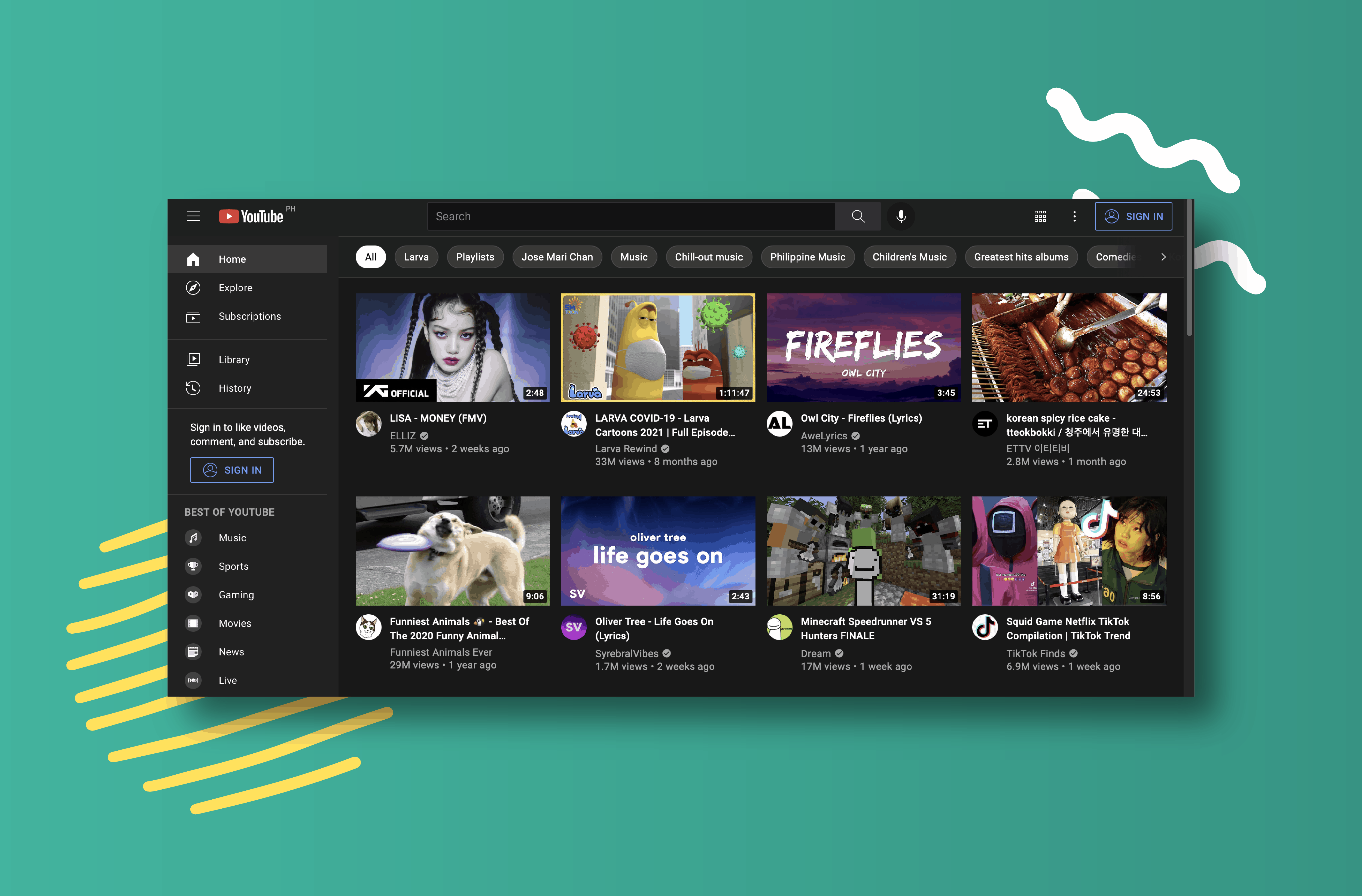
They know what they want you to do and they make it easy for you to do it.
With the rise in the popularity of mobile devices, website navigation has become more challenging.
But then, a great design can work its way around this challenge to improve the user experience.
Many aspects of web design contribute to the user experience:
- Fonts, colors, and images
- Headlines and CTAs
- Availability of contact information
- Page load time
- Form design
Did you see the first 3 items on the list?
Fonts. Colours. Images.
They are listed first for a reason: We consume them with our eyes first.
As we mentioned in a previous article, visual content is powerful.
An interviewee aims to make a good impression by dressing well on the interview date.
Diamonds are a girl’s best friend. You get what I mean.
The Solution: To attract potential clients, the website has to look good for them.
Get a designer who has a deep and wide knowledge of how fonts, colors, and images can help with website navigation and make the user experience better.
4. Poor call-to-action (CTA) placement
Call-to-action placement or design style is crucial in persuading website visitors to convert.
Without a well-positioned and appealing call-to-action, prospects might find it difficult to find the conversion button or link.
What makes an effective CTA design style?
- It must be clear where the website visitor should click
- The copy must be compelling
- The button must be strategically placed
📌 Tip: Having a high-contrast call-to-action button attracts attention.
So, where is the best placement for the CTA button?
That depends on the content density.
You can follow common layout scanning patterns to place your CTA button where people naturally tend to rest their eyes when reading.
We have two common layout scanning patterns: the F and the Z layouts.
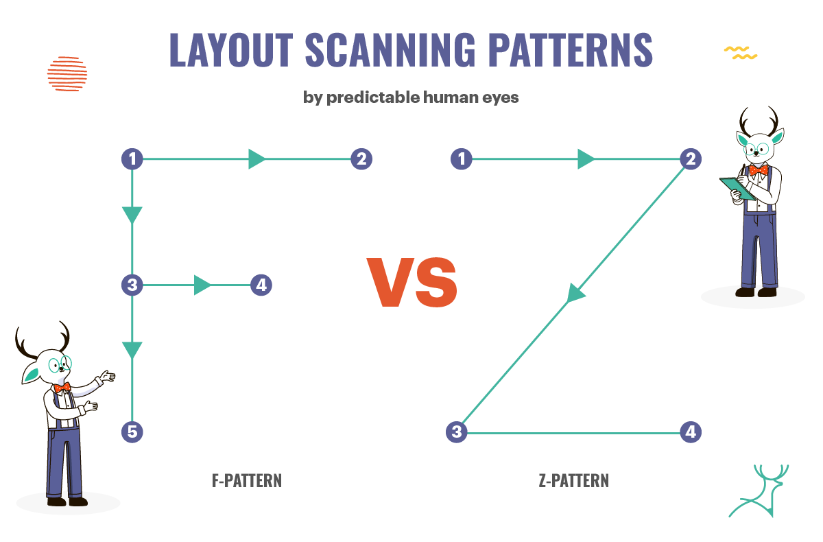
The Z-layout follows the natural tendency of movement for the user’s eyes.
This usually applies to book pages and web pages with large blocks of text with little to no hierarchy or elements that guide the users where to read next.
It can also apply to pages with minimal content and large gaps in between.
The F-layout offers a more in-depth understanding of the way people scan pages.
Jakob Nielsen, the father of F-pattern reading, presented his findings as:
“Eye-tracking visualizations show that users often read Web pages in an F-shaped pattern: two horizontal stripes followed by a vertical stripe.”
This means that readers tend to read in an F pattern, first horizontally, then vertically.
This scanning pattern can apply to pages with either dense or minimal text.
Is it sounding complicated to you?
The Solution: Instead of reading more about eye-tracking research and the various patterns and wasting more hours of your time, hire a professional web designer. Problem solved!
5. Cluttered web design layout
Have you seen a website that looks like a pack of Skittles spilled on the floor?
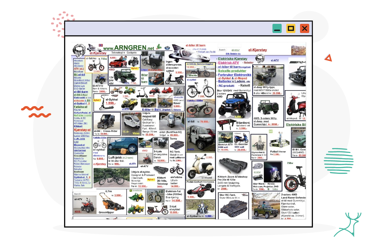
A cluttered website can have an excessive number of pages and overly busy design elements all over the place.
It may contain distracting images or an excessive number of advertisements.
These kinds of websites make it difficult for users to know what to read next or what they can interact with.
Remember to look beyond the home page.
If you have redundant categories and improperly designated content, the website design is still cluttered and will confuse you.
The Solution: If you find that the website you are developing has chunks of text and zero breathing room or white space, ask the copywriter to shorten the copy or to get the designer to adjust the spaces in between the elements.
The latter option might be easier and your brand story is kept intact.
Also, when planning website pages, keep the visitor in mind and make the website journey easy and enjoyable for them.
What is the most pressing issue with web design today?
The sixth one and probably the hardest to solve, is your lack of time.
With so many websites to create and so little time to do it, it feels like you’re constantly rushing.
Quality and creativity also suffer if you or your clients push simultaneous projects through deadlines.
Deer Designer can not only help you solve this most pressing problem but also allow you to scale easily as well.
Give us a try.
Looking for resources to guide you with your website design? Check out our guides:
➡️Top eCommerce website design tips for boosting traffic, engagement, and conversions
➡️Tips to design your website to convert visitors into customers: conversion-focused web design
➡️Everything you need to learn about SEO for web design to create a high-ranking website
Key takeaways
- Although people are spending so much time on their devices just scrolling through the internet, they tend to spend so little time on specific websites and can easily click out if you don’t offer them an enticing enough experience.
- It is important to keep your website design up-to-date and your site responsive and engaging to stay competitive.
- Some common problems with web design include outdated designs, low-quality content, confusing navigation, poor call-to-action placement, and a cluttered design layout.
- Instead of dealing with these problems one by one, you can just hire a web designer (from Deer Designer!) to take care of the design process for you.
