Designing for web accessibility: applying the w3c guidelines with examples

The second part of our two-part designing for web accessibility series is here!
In the previous article, we talked about the importance of color contrast in making accessible websites and gave a brief introduction to the web content accessibility guidelines (WCAG).
However, color accessibility is just the beginning.
As we continue our journey into crafting digital experiences that are inclusive for all, it’s important to delve into various aspects of a website that can contribute to a more universally accessible internet.
Even if you are not visually impaired, you might have come across certain websites with poor web accessibility. Have you ever experienced visiting a website so cluttered that you didn’t know what to read first or where you’re supposed to get what you’re looking for?
You might have even seen a website with unreadable fonts or poor spacing; you can’t read it even if you don’t have a visual impairment.
In this second part of our series, we will discuss how to avoid these kinds of mistakes in web design.
We’ll cover key aspects of accessible web design, including placement of elements on a page, headings, spacing, designing for different screen sizes, and providing media alternatives for text.
Easy navigation is essential to web accessibility
Navigating through a website should be a seamless experience for everyone, including people with disabilities.
This would benefit your site too, as people often click out of a website when they don’t know where anything is. If they don’t immediately see what they need, it’s unlikely for them to try and click around to find it.
You can help users understand your website navigation by having consistent naming, styling, and positioning across your web pages.
By having breadcrumbs and clear headings, you can inform people of where they are on your website, how they got there, and how they can look for other information on your site.
For example, at Deer Designer, even if you are in our blog articles at Deer Insights, there is a navigation menu on top. It shows what section of the website you are in and how you can go to the other sections, such as our home page, design samples, testimonials, and pricing pages.
Having proper labels for interactive elements in your UI
Ensuring that interactive elements like buttons, links, and forms are easily identifiable and usable is important. These need to stand out from the regular text on your site, or people will not know that they can click them.
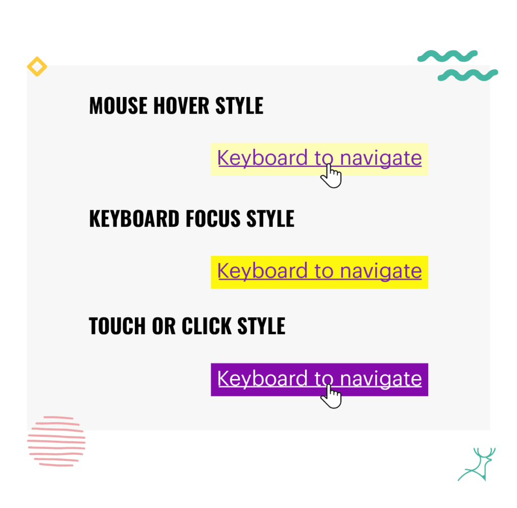
You can have these interactive elements change their appearance upon mouse hover, keyboard focus, or touch-screen activation.

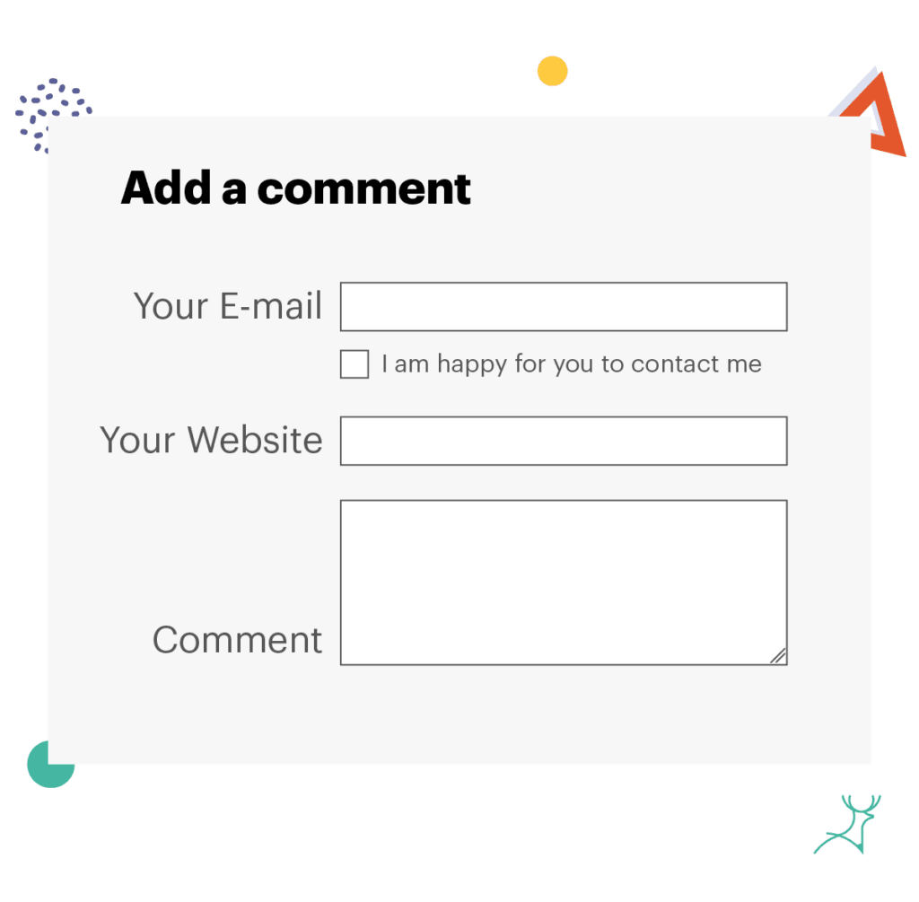
In the same way, you should also put labels in areas that clearly indicate what they refer to.This is particularly important in forms.
Your labels should be right next to your input fields, with the label on the left or above the field.
Checkboxes should also be right next to their related field.
For example, if you are asking a client to check a box if they are willing to subscribe to your newsletter, the checkbox should be next to the information they are sending to join the newsletter, such as their email and company name.
If you put this check box at the very end of your form, they might not realize that the email they included in the form is not the email they want to use to receive the newsletter subscription.

Make use of headings and negative space to group content for users with disabilities
Proper use of headings is important for your website, not only for the organization but also for users who rely on assistive technologies.
Properly structured headings not only organize content better but also aid screen reader users in understanding the layout and context of the information.
Voice assistants and page crawlers use these headings to understand the format of your article.
Using heading tags (H1, H2, H3, etc.) and maintaining consistent spacing between elements helps organize content for easier scanning and digestion, particularly for users relying on screen readers.
For visual readers, the different sizing and line weights of the headings help indicate which information is related to each other and allow them to scan through your website to check if they find your content relevant.
Without enough whitespace, your content might look too cluttered, difficult to scan, and hard to read.

Boosting web accessibility through media alternatives to videos and images
Visual content plays a significant role in web design, but it’s essential to provide alternatives for those who may not be able to perceive images or videos.
Incorporating descriptive alt text for images, transcripts for videos, and captions for audio content ensures that everyone can understand the information presented.
At Deer Designer, we now have the option to listen to our Deer Insight articles as audio through our Spotify podcast. This way, you are not limited to visual reading.
Additionally, providing options for users to adjust media settings, such as controlling autoplay videos or adjusting font sizes, further enhances the overall user experience and inclusivity of the website.
Passing accessibility standards through adaptive design for different screen sizes
It’s important to think of multiple devices since you want to reach as many people as you can.
Your audience might be on a phone, a tablet, a desktop, or a laptop, so you have to make sure your designs remain functional and visually appealing across all platforms.
This is important because most people, about 4.97 billion worldwide, use their phones to go on the internet. In fact, 60% of website visits around the world are from mobile devices.
When you embrace responsive design principles like fluid layouts and flexible media queries, your content will easily adjust to various screen sizes and resolutions.

Exploring designs in zoomed browser views helps identify and solve any potential accessibility barriers. You can make sure that users can engage with your content without much hassle, even if they have low vision and have to access your site while zoomed in.
Making digital experiences for everyone by ensuring website accessibility in the design process
We want to make websites and apps that are easy for everyone to use.
There are lots of little things we can do to help.
You can start using colors that people can see clearly, putting buttons where they are easy to find, and making the site easy to get around.
That’s why thinking of the right colors, element placement, site navigation, and other things is important.
When we take the time to get these little things right, it helps people with all kinds of abilities use websites and apps more easily.
At Deer Designer, we really care about creating designs that work well for everyone; we are committed to championing accessibility in web design!
We want every person who visits our sites to be able to use them smoothly.


