Exploring the hottest color trends of 2024 across industries
Colors are the lifeblood of the design world, whether it’s for digital, print media, fashion, or even interior design.
They’re like the brushstrokes that bring brands, products, and spaces to life.
They have the power to breathe life into brands, products, and spaces.
In fact, the way you combine colors in a design can affect how a viewer perceives it, making it look either modern or outdated.
Join us on a journey through this year’s trending color palettes that are making waves across many industries.
2023 gave us pastels, bold and bright, retro, and monochromatic colors.
Let’s see what color trends 2024 has in store.
From bold hues to harmonious blends, we’ll decode what’s hot right now.
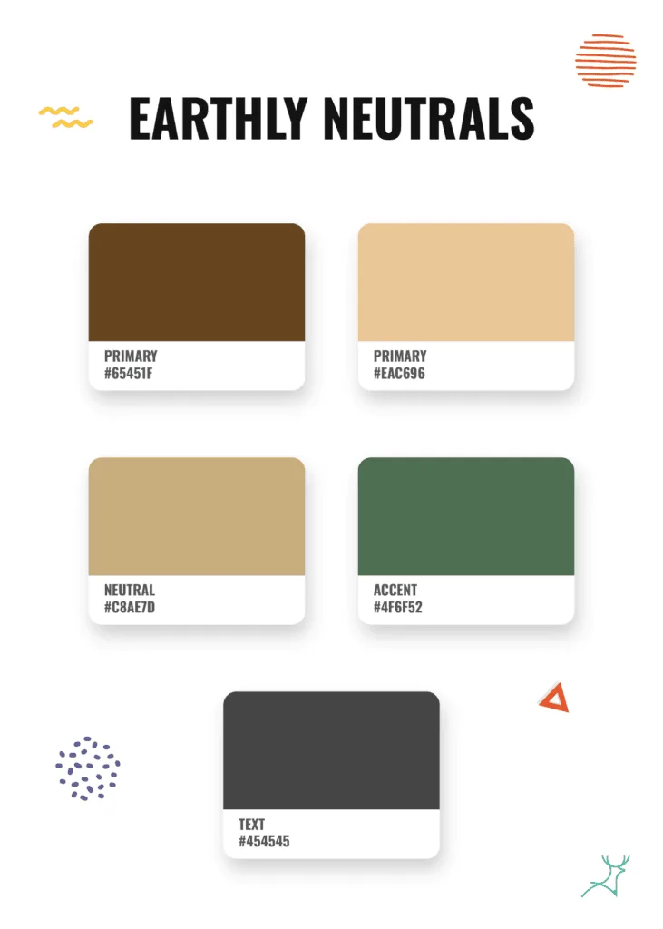
Rich neutrals with the dark and earthy color palettes of Dutchboy’s Ironside
Dutch boy’s color of the year 2024, Ironside 422-7DB brings a twist to some of our beloved neutral color palettes.
While it is based on a paint color, it can also be applied to graphic design.
Neutral colors are getting an elevated new look with bold combinations, giving a classy and flexible style.
You can liven up your dark moody neutral colors with warm earthy tones.
Include deep greens and warm persimmons in your color choices.
These pops of color bring richness and elegance to designs.
This style is especially popular in nature-inspired home decor and fashion, offering a classic and versatile color scheme for many uses.
Cool and soothing shades of blue with Benjamin Moore and Sherwin-Williams
Designer experts are expecting to see a lot of blue in 2024 as well.
This is particularly trendy because two paint companies have chosen different shades of blue as their color of the year.
Benjamin Moore’s Blue Nova 825 is a bright color that might make you think of peaceful skies and calm waters.
This shade of blue gives a modern touch to traditional color combinations, bringing a feeling of peace and clarity to spaces.
Whether it’s used as the main color or just as an accent, the cool and calming blue palettes created from this color offer endless opportunities for expressing creativity.
The soft blue-gray of Upward by Sherwin Williams brings a peaceful and uplifting feeling to any design, making it a great accent color.
You can use this instead of plain gray or white for a more sophisticated touch.
Here’s a combination of both colors.
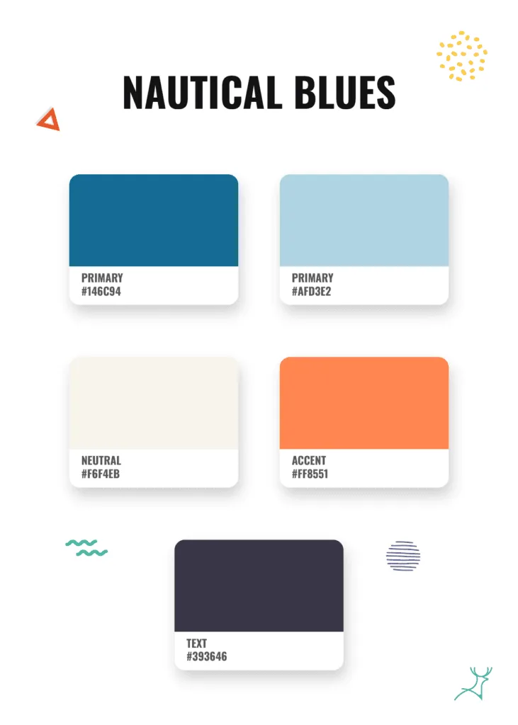
Centered around the serene “Blue Nova 825”, this nautical palette is bound to make a splash as it creates a perfect mix of calmness and dreaminess to any design.
With hints of blue skies and complemented by warm sandy shores, this palette gives off the tranquility of coastal getaways.
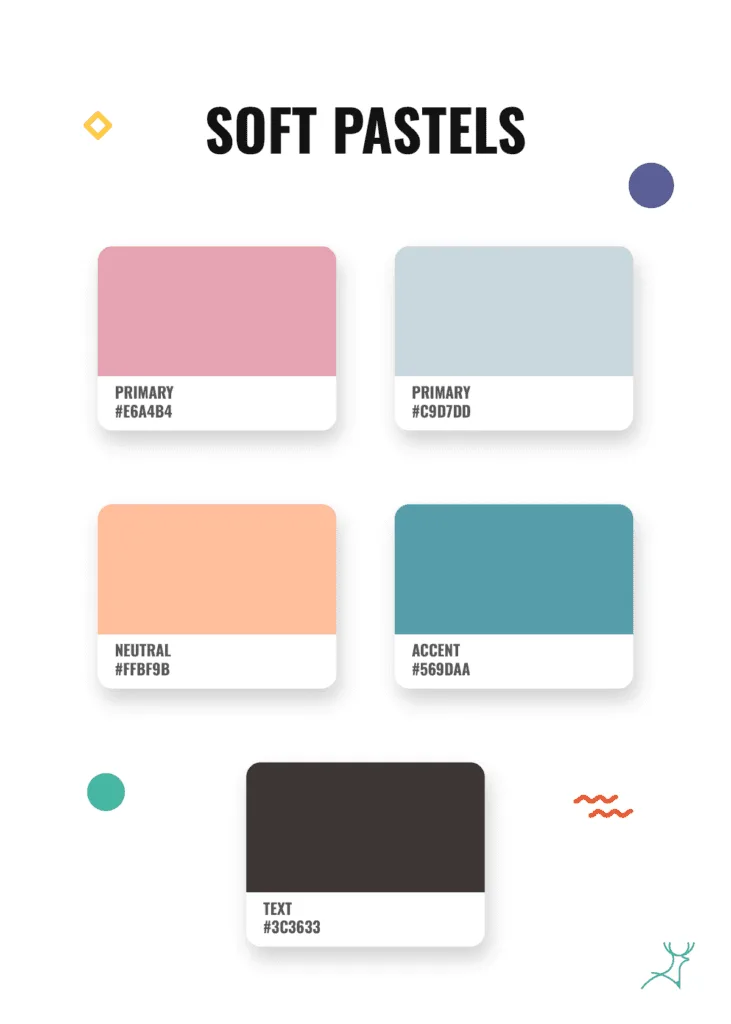
Pastel colors with Pantone peach fuzz
The Pantone Color Institute has picked Peach Fuzz as their color of the year for 2024.
It’s a fantastic standout color on its own, and it also works well with different shades of pink for a soft color palette.
Nostalgia is making a comeback with vintage pastel colors and softer tones.
Gentle pinks, light purples and lilacs, soft shades of greens, and pale blues are becoming more prominent, bringing a feeling of warmth and familiarity.
There are various ways to incorporate this trend into any design.
It is especially noticeable in branding, packaging, and fashion design, giving a sweet reminder of the past while creating modern and stylish visuals.
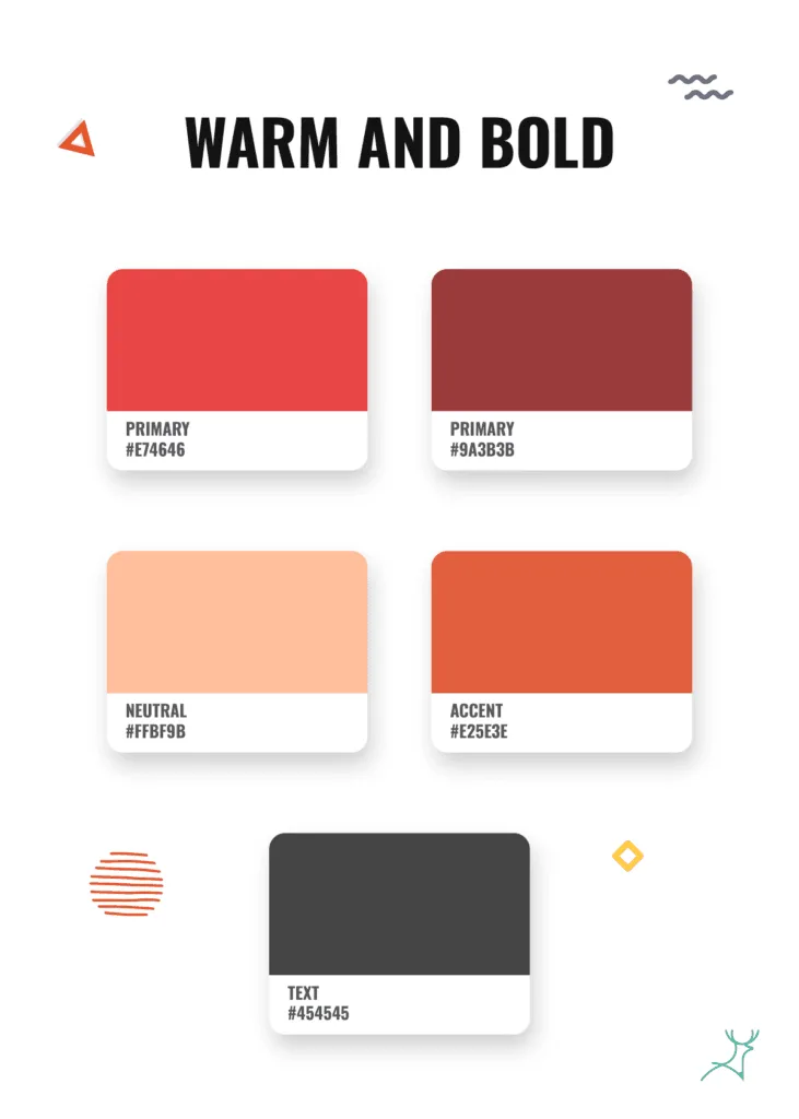
Chic, warm, and bold red hues
For those who seek to make a bold statement, the trend of bold colors and vibrant contrasts is still captivating the design community.
This fiery red color scheme makes eye-catching designs.
This trend is becoming popular in digital design, advertising, and branding, adding a lively and thrilling element to visual communication.
Keeping up with design trends for 2024
These trends are crafted by the brilliance of the experts in color marketing and development.
These color experts are constantly looking for new colors and combinations that work best in designs – whether you’re looking for a trendy coat of paint or a versatile color palette.
As an on-demand design service, we need to know and use these popular color combinations in our work.
Keeping up to date with the color trends in 2024 is not just a choice; it is also our important duty.
By embracing the many changing color trends in the design world, we make sure that our clients get designs that not only get noticed but also fit with the current trends.
Whether it’s the calming charm of earthy colors, the modern feel of futuristic colors, or the timeless style of single-color schemes, we’re here to explore all the possibilities for our clients this year and for the coming years.


