How to nail your small biz look: A guide to rockin’ visual identity
So, my buddy Emma had this awesome idea to open her own preschool, but when it came to the visuals, she was totally lost. Picture a Picasso painting that had a rough day: that was her logo, and her colours… let’s not even go there 😭
Emma’s a real art buff, and she’s even made some cash off her abstract pieces, so she thought it was all cool. She figured her students could whip up similar artwork.
I couldn’t stand by and watch her do this. There’s a big difference between abstract and commercial design, you know? So, I dove in with my visual identity cape on. I told her straight up that her brand needed to attract parents, not just kids.
Lucky for me, she agreed and asked for help. Here’s how we turned her brand around, just in case you’re wrestling with a similar beast. Plus, I’ll share how Emma’s brand came to life, and you might pick up a tip or two.
8 steps to whip up a killer visual identity
Giving your brand a personality
I asked Emma what made her preschool unique. Turns out it was a creative hub for tiny Picassos, thanks to Emma’s background in art. So we noted down things like kiddie icons, palettes, and paintbrushes we could incorporate.
Designing a cool logo
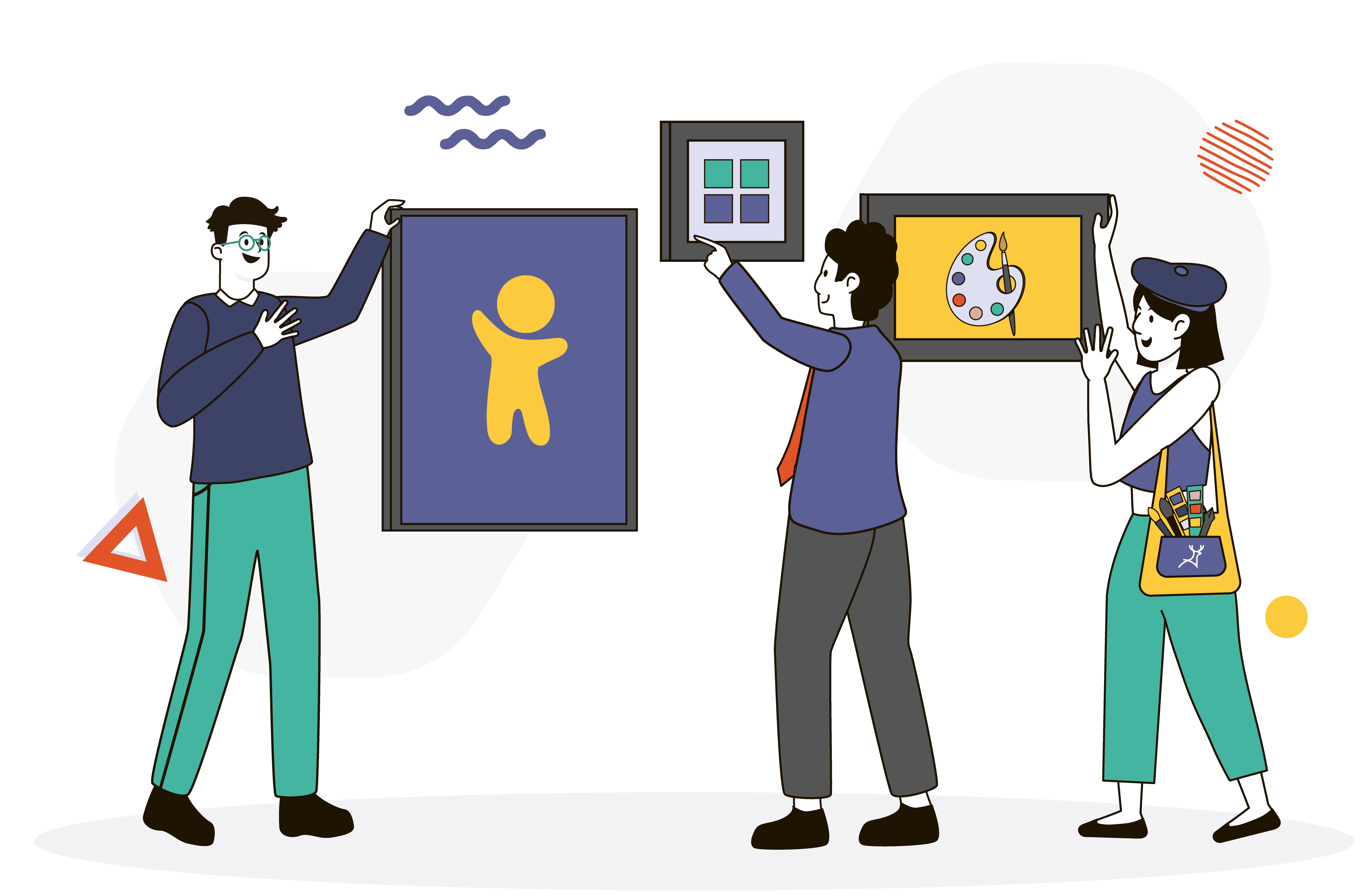
This is like the superhero badge of your business. We got Deer Designer on the case to come up with a logo that screamed ‘Emma’s Preschool.’ They gave us options and a handy checklist to help us nail it.
Picking the right typeface
Emma tossed the typography ball in my court since I’m a word geek. But being a copywriter, my priority was readability.
So we sought the help of the professionals at Deer Designer to choose fonts that are easy on the eyes yet still look great everywhere.
💡 Quick tip: get a typography guide for your brand to keep font usage consistent.
Emma asked me to pick the fonts since I’m good with words. I couldn’t help but laugh because, as a copywriter, my main concern is making sure the words are readable on any surface.
Getting the colours right
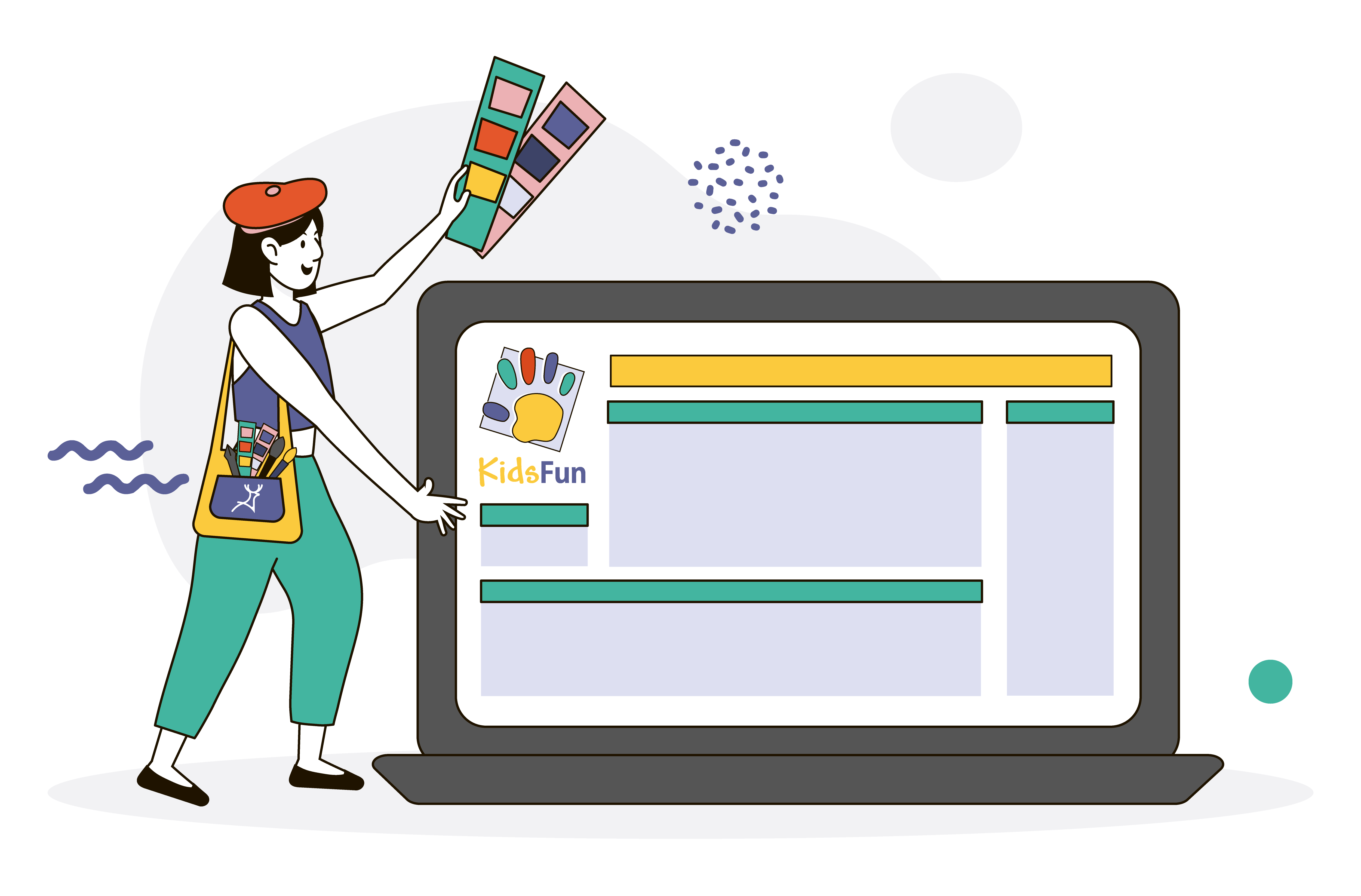
Emma can paint a mean canvas, but picking a colour scheme for her preschool was too personal for her. So we kept it simple – one main colour that captured her brand’s spirit and a few others for extra zing.
Nailing the visuals
A few weeks in, Emma started sharing photos of kids’ activities. But oh man, it was a hot mess of different photos and drawings. I had to remind her to stick to her brand imagery in the guide.
She couldn’t share photos of kids because of privacy reasons, which is totally cool. I suggested using custom illustrations, icons, or graphics instead to bring her brand story to life.
Keeping it consistent
Fast forward a few months, Emma’s preschool started catching on, and she got invited to a book fair. She needed all sorts of marketing materials like brochures, flyers, and banners. Good thing Deer Designer was able to deliver those too.
Think of your brand as a chameleon, fitting into every platform it touches. Stick to your visual identity everywhere – online, offline, you name it. The key is, potential customers should recognize your brand wherever they see it.
Making it real
At Emma’s school’s Christmas do, I noticed all the teachers rocking t-shirts with the logo. They had the logo colours and size just right.
I didn’t want to geek out over branding at the party, so I just casually mentioned that those shirts could double up as informal uniforms. And I’m sure the teachers were on board with that.
When you update your brand or create a new one, you should spruce up your website, and social media profiles to flaunt your shiny new visual identity. Clue in your team about why consistency is a big deal, just like Emma did.

Keeping an eye on things
Keep tabs on how your visual identity impacts your brand recognition. Be open to feedback from customers and tweak things as needed. It’s all about getting better and better.
Over to you!
And there you have it, folks! Emma cracked the code on how to give her small biz a solid visual identity. If she can do it, so can you! If you’re feeling stuck, remember Deer Designer is just a call away.
You don’t need to keep a designer on your payroll, just have your design team whip up a brand guide, and you’re sorted!