The art of color harmony: a guide to color theory to create a balanced design

I used to think that picking colors for designs was as simple as choosing the shades that looked pretty.
And even after I became a designer, I trusted my instincts rather than theory.
You know when you stumble upon a breathtaking piece of artwork that just speaks to your soul?
The colors seem to dance together, creating a symphony of emotions.
That’s when it hit me: There’s more to color than meets the eye.
Think back to those iconic paintings you can’t forget.
Van Gogh’s The Starry Night, with its vibrant blues and yellows, evokes a different feeling compared to Monet’s serene water lilies in calming greens, blues, and pinks.
And guess what? Mastering color harmony is not just about choosing pretty colors. (I wish it was!).
The artist has to play matchmaker, pairing colors that harmonize with the concept and stir up the right emotions.
Choosing the right color palette can make your designs “sing” and leave a lasting impression on your audience.
So, what’s the secret sauce behind these mesmerizing color palettes?
Well, it’s all about mastering color harmony—the art of blending colors in perfect sync. And trust me, it’s not as easy as it sounds.
So in this guide, I’ll talk about the basics of color theory, color harmonies, and how you can use them to sprinkle some magic into your designs.
It can take a lot of practice and experience to know which colors create visually pleasing and harmonious color palettes, but this will help you understand what designers think when they choose colors for your designs.
Understanding color theory
Before diving into color combinations, you should first understand color theory.
You shouldn’t think of colors as individual reds, blues, and yellows.
They can combine and interact with each other, creating various visual effects.
You might be familiar with the color wheel, as we are shown this as young students learning colors for the first time.
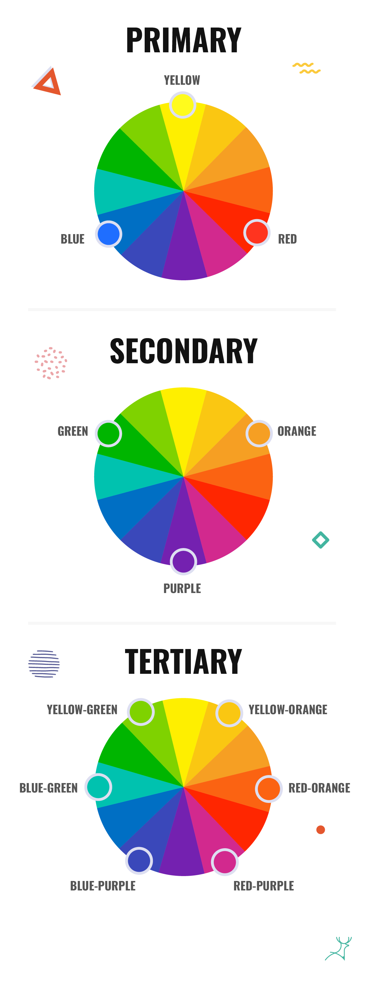
The color wheel is a fundamental tool in color theory, as it groups colors by how they interact with each other.

- Primary colors: Red, blue, and yellow are the foundation of all other colors and cannot be created by mixing other hues.
- Secondary colors: Green, orange, and purple are formed by mixing primary colors.
- Tertiary colors: These are created by mixing a primary color with a neighboring secondary color on the color wheel.
Color harmony schemes
Now that we have a basic understanding of the color wheel, let’s explore different color harmony schemes and how they can be applied to your designs:

Complementary colors
Complementary colors sit opposite each other on the color wheel, creating a high-contrast and dynamic effect.
For instance, pairing blue with orange or red with green can create striking visuals.
However, it’s crucial to balance the intensity of complementary colors to avoid overwhelming your design.
Analogous colors
Analogous colors are adjacent to each other on the color wheel, creating a harmonious and unified look.
This scheme is ideal for creating a sense of cohesion and tranquility in your designs.
For example, combining shades of teal, green, and yellow-green can create a lush and earthy atmosphere.
Triadic colors
Triadic color schemes consist of three colors of equal distance from each other on the color wheel, forming a balanced and vibrant palette.
Using primary colors (red, blue, and yellow) or secondary colors (orange, green, and purple) in a triadic scheme can result in visually stimulating designs.
Split complementary colors
This scheme is a variation of the complementary scheme, where instead of using the direct opposite color, you choose two adjacent colors to the complementary hue.
For example, pairing green with red-orange and red-violet creates a harmonious yet interesting composition.
Double complementary colors
Double complementary colors are created from a set of four colors that form two complementary pairs.
All it means is that one pair of colors is directly opposite each other on the color wheel, while the other pair consists of colors that are a mix of the two original complementary colors.
For example, if the original complementary pair is red and green, the double complementary colors would be red, green, blue, and orange. Got it?
That creates a balanced and visually pleasing palette that can be used to create contrast and dynamics in a composition.
Monochromatic colors
Monochromatic color schemes involve using any one of the colors on the color wheel with different levels of brightness, saturation, or hue.
This approach creates a clean and sophisticated look while maintaining visual interest. Experiment with different shades and tints of color to add depth to your design.
Tips for creating harmonious color palettes
Now that we’ve explored different color harmony schemes, let’s discuss practical tips for selecting and combining colors effectively:
Consider the context
First, you have to understand the purpose and audience of your design and choose appropriate colors.
For example, vibrant hues might be cool for a youthful brand, while muted tones will convey sophistication.
Balance warm and cool tones
Try to incorporate both warm and cool colors to create contrast and balance in your design.
Warm colors (reds, oranges, and yellows) can bring energy and excitement, while cool colors (blues, greens, and purples) create a sense of calmness and serenity.
Utilize color psychology

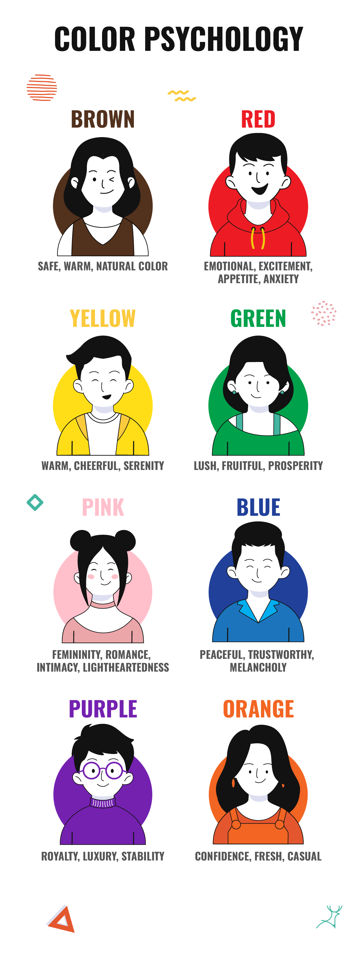
Colors have psychological associations that can influence emotions and perceptions.
For instance, blue is often associated with trust and peace, while yellow signifies warmth and cheerfulness.
Always consider the message you want to convey and choose your colors accordingly.
Experiment with color palettes
Don’t be afraid to experiment with different color combinations until you find the perfect palette for your designs.
There are a lot of tools out there, like Canva and Adobe Color, that have color palette generators that can help you explore various color harmonies and find inspiration.
Pay attention to the contrast
Never forget to make sure there’s sufficient contrast between text and background colors for readability.
High contrast can enhance legibility and draw attention to important elements in your design.
Limit your palette
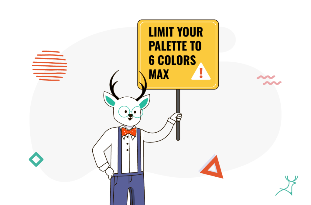
As much as you can, avoid using too many colors in your design, as it can lead to visual clutter and overwhelm the viewer.
Stick to a limited palette of 2–6 colors to maintain cohesiveness and harmony.

Consider accessibility
Always ensure that your color choices meet accessibility standards, especially for web and graphic design.
Contrast ratio, color blindness considerations, and text legibility are essential things to consider for inclusive design.
Using color harmonies to choose key color combinations in your design
“Gut feeling” isn’t the best way to go.
Mastering color harmony is a fundamental skill for designers looking to create visually stunning and impactful designs.
Whether you’re crafting a brand identity, designing a website, or creating marketing materials, play a bit with these tips and techniques, as they’ll help you achieve harmony and balance in your color palettes.
So go ahead, unleash your creativity, and paint the world with beautiful designs!
Key Takeaways
- Choosing the right color palette for your design can make it more cohesive and memorable for your audience.
- Colors in the color wheel are divided into primary, secondary, and tertiary groups, and different colors from these groups can be combined together to form a color harmony scheme.
- Other than color harmony schemes, you will also have to consider the context of the design you are making, as colors have different meanings.
- While it is great to experiment with different colors in your palette, you will have to consider factors like accessibility and contrast in your design.
- Using too many colors on a design may not be good either. It is best to limit it to six colors max.


