What does ‘make it pop’ mean in design? A designer’s guide
“Make it pop” – these three words make designers worldwide cringe. But what does “make it pop” mean in the design world? Whether you’re creating a social media graphic or developing examples of mascots, this feedback is almost universal.
Just ask Kyle Carpenter, editor-in-chief of Clients From Hell. During his presentation at the 2019 HOW Marketing Live conference, he polled a room full of designers about this phrase. Unsurprisingly, nearly every hand shot up.
The thing is, this seemingly vague feedback actually points to something specific: the client wants your design to stand out. It’s part of a family of equally puzzling comments we’ve all heard:
- “Needs more oomph”
- “Add a wow factor”
- “There’s something missing”
- “It’s not there yet”
- And the ever-mysterious “Surprise me”
As professional designers, we’ve learned that these aren’t just frustrating phrases – they’re opportunities to better understand what our clients really want.
Let’s decode the mystery behind the “pop” and transform this common feedback into actionable design improvements.
Understanding the “pop slang meaning” in design feedback
When design clients say “make it pop,” they’re often trying to articulate a vision they can’t quite put into words. As experienced designers, we’ve learned that this feedback, while vague, usually signals that the client wants their design to stand out – they just might not know exactly how.
Here’s what we’ve discovered about handling this common design feedback:
Every client envisions excellence differently. Rather than seeing this as a frustrating challenge, treat it as an opportunity to dig deeper and understand their specific needs. After all, great design is about solving problems, not just making things look pretty.
Turn vague feedback into actionable insights:
- Ask for inspiration: Request examples of designs they love. The more samples, the better – these become your visual clues.
- Look for patterns: Do their examples feature bold colors? Custom typography? Clean layouts? These elements help decode what “pop” means to your graphic design clients.
- Ask clarifying questions: “What specifically draws you to these examples?” or “Which elements stand out to you most?”
Remember, when a design client says, “make it pop,” they’re inviting you into a collaborative process. With the right approach and clear communication, you can transform this seemingly vague request into a successful design that truly stands out.
Key design elements that create visual impact
Understanding why graphic design matters starts with mastering these fundamental elements that can make your designs truly stand out.
Here’s how each element contributes to that sought-after “pop”:
Color psychology
Strategic use of color transforms ordinary designs into memorable experiences. Whether it’s creating striking backgrounds or emphasizing key elements, colors trigger emotional responses and shape how graphic design clients perceive your brand.
A well-chosen color palette can instantly elevate your branding illustration from good to exceptional.
Typography
The right font combination does more than just convey words – it builds brand personality. Modern studies indicate that typography significantly influences how customers connect with your brand.
Consider using:
- Distinctive headline fonts for impact
- Clean body text for readability
- Consistent font families for harmony
Scale and hierarchy
Strategic sizing guides viewers through your design while creating visual interest. By varying element sizes, you can:
- Draw attention to key messages
- Create clear navigation paths
- Highlight important information naturally
Texture and depth
Adding texture brings designs to life, creating visual interest that captures attention. Whether through subtle patterns or bold overlays, texture adds dimension that makes designs more engaging and memorable.
Linear elements
Lines aren’t just dividers – they’re powerful tools for:
- Creating structure and flow
- Directing attention to key elements
- Building visual relationships between components
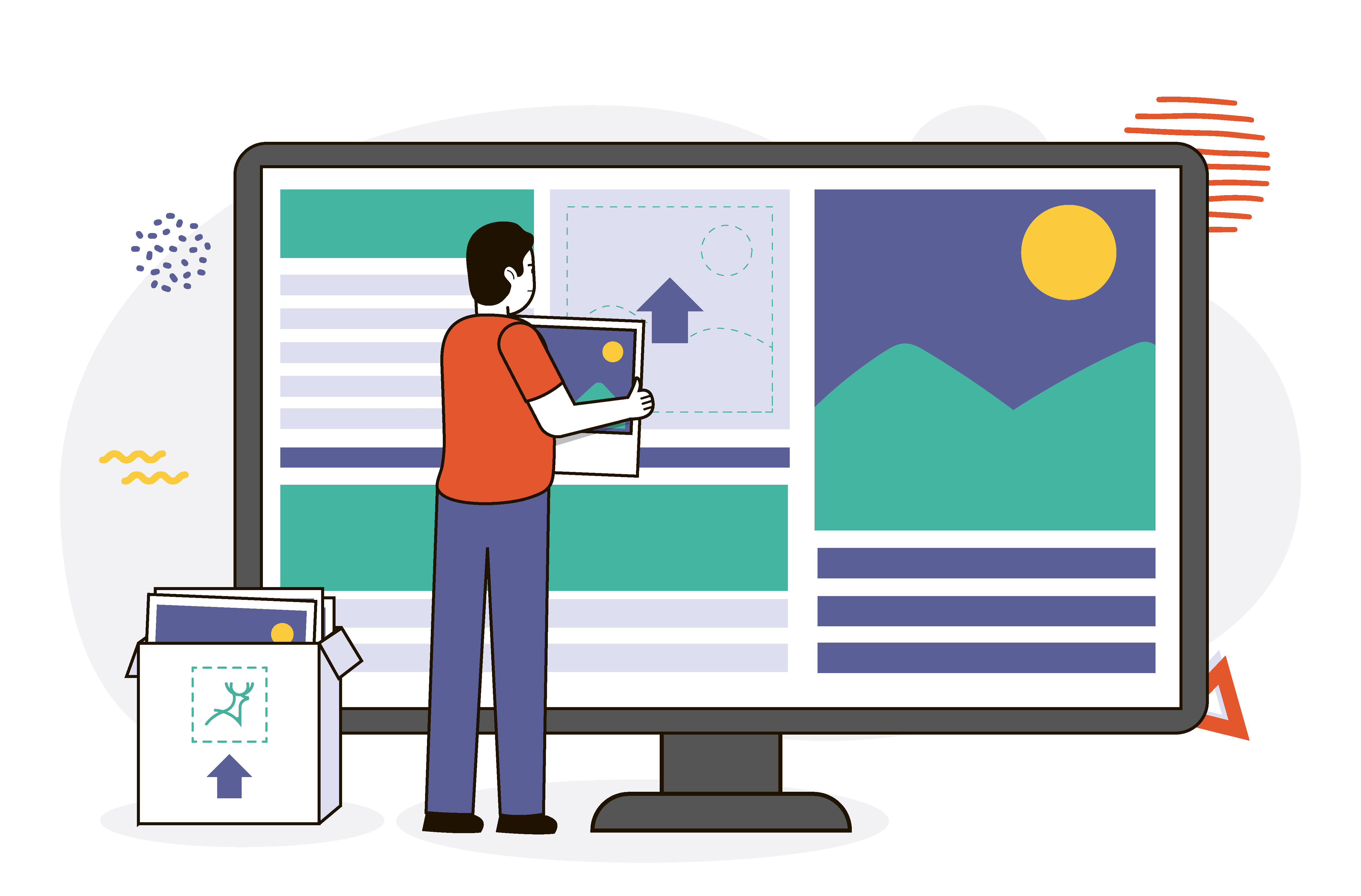
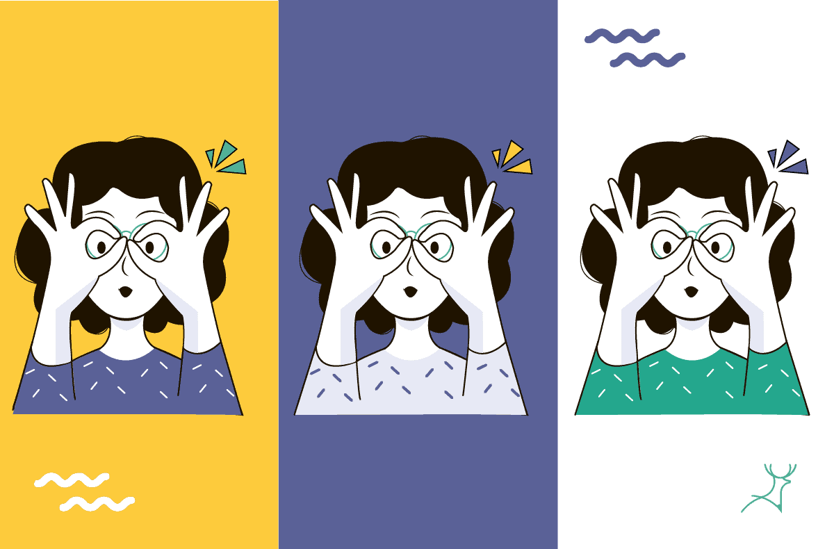
“Make it pop” sample designs

Practical techniques to enhance design impact
Whether you’re working on agency logo design projects or creating brand illustration guidelines, here are proven strategies to make your designs stand out without risking plagiarism in art:
Color enhancement
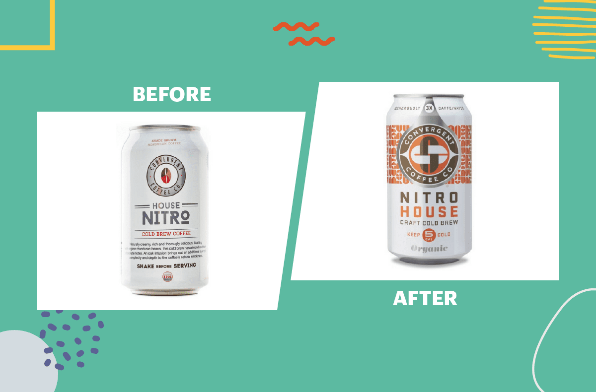
Transform designs by experimenting with color intensity. Show clients before-and-after comparisons to demonstrate the impact of these adjustments.
Through our graphic design subscription service, we’ve found that subtle color adjustments often make the biggest difference.
Strategic color pairing
Create 2–3 variations using:
- Brand-aligned color combinations
- Complementary color schemes
- Contrasting accent colors
When working on logo redesigns, ensure each color combination maintains brand recognition while adding fresh energy to the design.
Typography hierarchy
Guide viewers’ attention by:
- Adjusting font sizes strategically
- Creating clear reading paths
- Highlighting key messages through scale
Font selection and arrangement
While respecting brand guidelines, explore typography that:
- Matches the business personality
- Enhances readability
- Creates visual interest through contrast
Real-world success stories
Let’s examine how leading brands have successfully enhanced their visual impact while maintaining their core identity. These examples demonstrate how subtle adjustments can create significant improvements in design effectiveness.

Transform feedback into outstanding design
The secret to making designs truly stand out often lies in thoughtful experimentation. While staying true to brand guidelines, skilled designers know when to push creative boundaries to achieve that perfect balance of familiar and fresh.
Creating multiple design options that “pop” requires time, expertise, and an understanding of what makes each brand unique. But here’s the good news: you don’t have to tackle this challenge alone.
Wondering how much is a design subscription that gives you the freedom to experiment? At Deer Designer, we understand the importance of getting designs just right.
Our on-demand design service lets you explore multiple creative directions and refine them until they match perfectly your vision – all without the usual time and budget constraints.
Ready to make your designs stand out? Let’s create something extraordinary together. Book a call with our team today and discover how we can help your brand pop.