When is the right time to use an infographic?
I love reading, but not everything.
Oftentimes when I am online, I only read to get the exact information I need. I am an excellent skimmer – like 43% of people surveyed by Hubspot – who only look for the needed info and then, leave the webpage almost immediately.
Even though I love words, I hate authors who bury information under 2,000 words or under a data tsunami. Can you imagine how frustrating it is for people who don’t have the time to read all of that?
That’s why infographics were invented.
Many businesses already use infographics to present their company’s accomplishments or research. But before jumping on the bandwagon, let’s first understand what infographics are and why it matters.
What are infographics?
Some companies need to share loads of information with their employees, readers, and clients. No matter how lean they want the data to be, there are some topics that need more historical information to make more sense.
If you’ve been in a corporate meeting or presentation, the pie charts, bar graphs, and Venn diagrams you’re familiar with are the early versions of infographics.
Now they have evolved into shareable, attractive illustrations that catch the attention of the target audience by showing data, processes, or stories through visual representations. It also gives a deeper understanding of the flow of the idea.
With the proper use of proportion, colour, and negative space, a data tsunami can be transformed into something that is attention-grabbing, memorable, and even persuasive.
When to use infographics?
The best fit for infographics is when:
- There is a need to communicate the information quickly,
- You want your audience to remember the data,
- You want the message to have an impact,
- You want an easy-to-share version so the data can be appreciated by more people.
Three different types of Infographics
Infographics have three general categories:
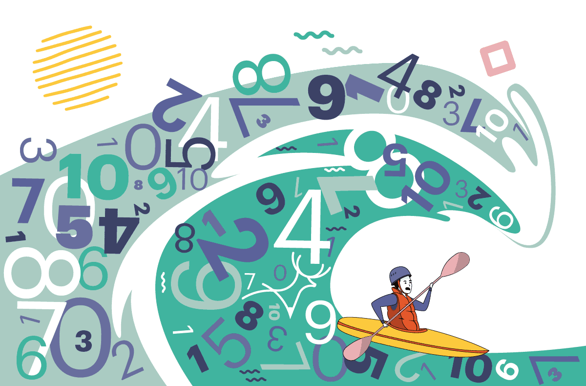
Data visualization
Data visualization infographics commonly come in the form of a chart or graph. Oftentimes, the data presented in this type of infographics are simple but with different examples.
It’s usually used for business presentations that need to show chunks of data at a glance, such as sales performance, increase in profits, accomplishments and the likes.
Data visualization infographic sample


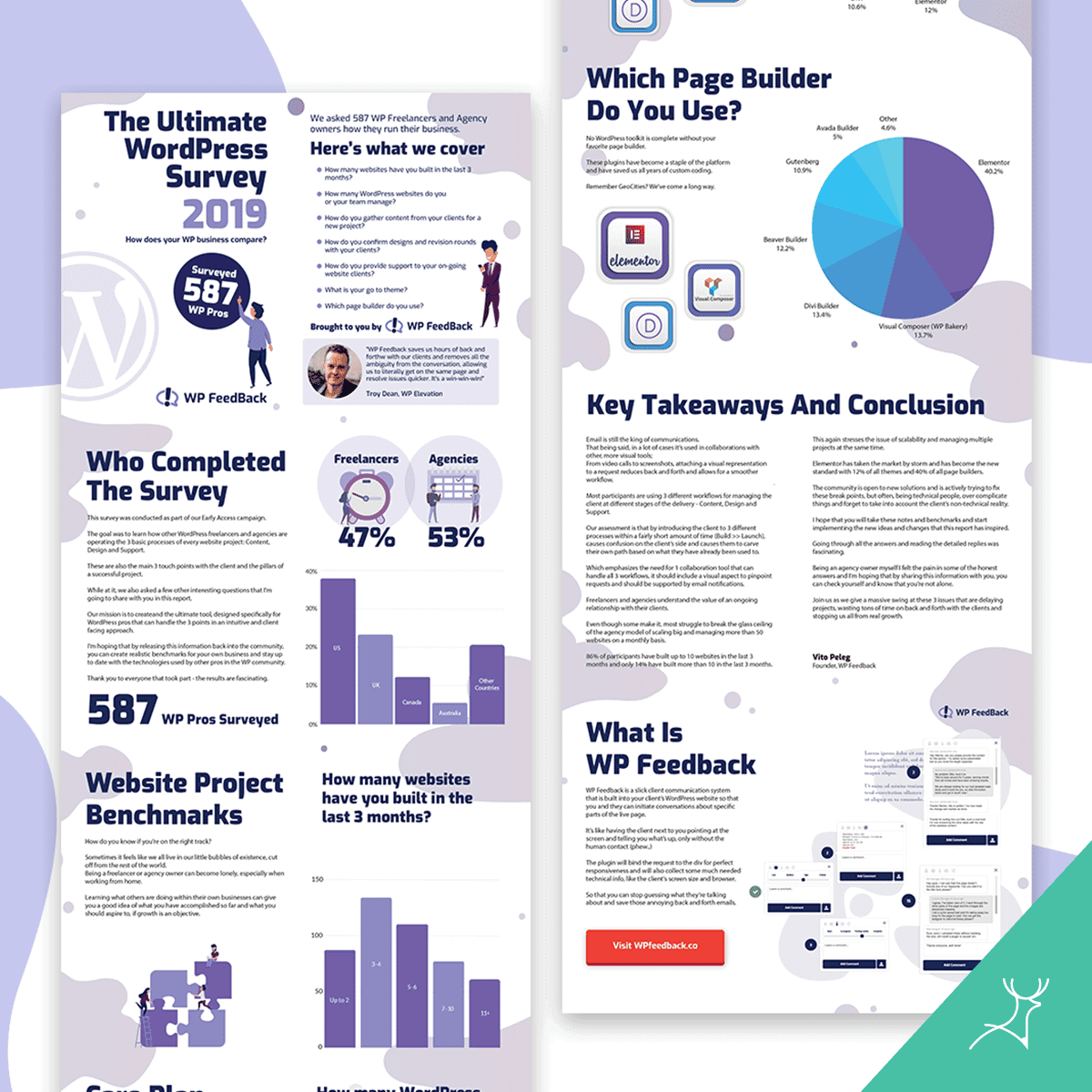
Information design
Information design is a more comprehensive presentation of information. This is the best type to use if you want to explain a process, chronology, or anatomy.
Information design infographic sample


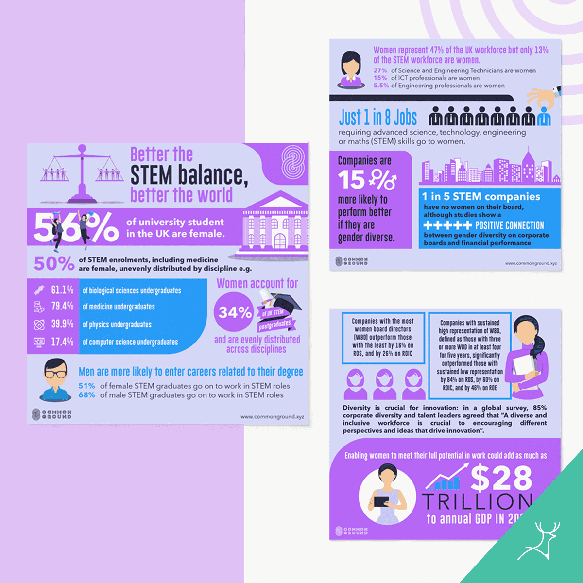
Editorial infographics
This type is the most reputable because this doesn’t simply present a story or data, it presents a combination and is also backed up by well-researched information.
The design is comprehensive, involving all the angles to allow your target audience to have an in-depth understanding.
This is commonly used by companies who are launching a new project, presenting the result of years of research, or championing an initiative.
Editorial infographics sample
Design must be comprehensive
Messy, ill-designed infographics are a waste of good content. I need to say this now because you might be tempted to do it later: DO NOT D-I-Y an infographic!
It is too complex to be designed by a non-designer. If done by an amateur, infographics only become coloured essays.
Only professionals can make infographics compelling and useful.
Because you have dedicated so much time to research and data compilation, you deserve to have a professional designer design the best infographic that your company can be known for.