How a follow-worthy, consistent Instagram colour palette is made

Families wearing matchy-matchy clothes are a joy to see. I’m constantly amazed because I know it takes a lot of planning and coordination.
Family twinning is not just about buying the same clothes, but actually making sure it looks well on everyone and for the occasion. Some even go as far as having everything customized by dressmakers.
A family who has the luxury of buying look-alike clothes also shows not only a fashion sense but also a constant effort to make everyone look nice and put together.
If you’d like to show similar efforts in making your clients look good as part of your branding, you could easily do it with a consistent Instagram colour palette.
Marketers and business entrepreneurs use their Instagram feed to boost brand awareness, increase engagement with their followers, and ultimately turn them into paying customers.
Your audience must understand the purpose of every visual content that you post.
Your Instagram profile’s goal should be to convert visitors into followers, just like the purpose of your website is to convert visitors into clients.
While you create fun and valuable reels and stories, a well-curated feed actually gets you more Instagram followers.
Is a consistent Instagram colour palette a must?
Yes and no. Social media isn’t static. It changes all the time.
A couple of years ago, a cohesive colour palette did a lot for follower growth. Today, it’s more about individual posts. Yet, you do want to have some consistency so that new followers can instantly know what you do.
In the past, only companies employing full-time in-house designers were able to create consistent and on-brand Instagram feeds. Nowadays, you can get it done with Deer Designer or by following these simple tips:
Check your Instagram colour palette online
Start with what you have. If you are a plant-lover, your Instagram feed will most likely display shades of green. If you’re unsure because you post about random interests, ask your design team about your main brand colour and other colours that will go well with it.
The best practice is to check back often or anytime you are going to batch or schedule your posts as the colours may change.
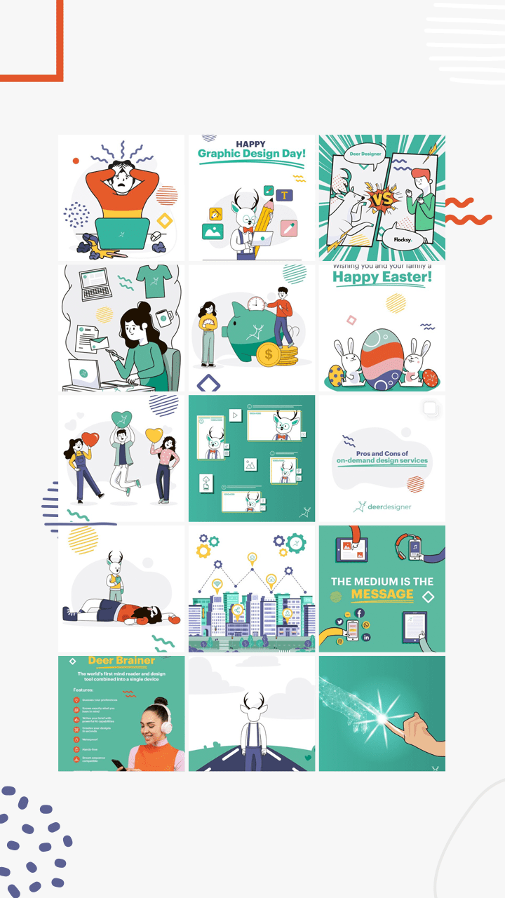
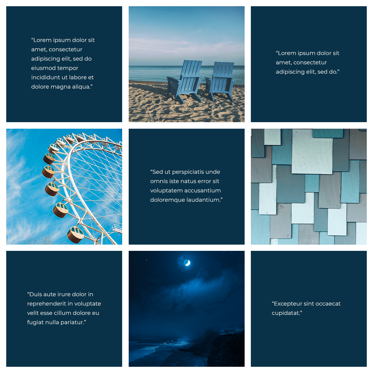
Deer Designer’s primary colour on Instagram is green. Have a look.
How to style an Instagram feed
1. Stick to a primary colour
By picking a primary colour and making sure that it is present in every photo, you can make your Instagram feed flow visually.
It doesn’t matter if sometimes an image will have hints of other colours, as long as the primary colour is somewhere to be seen.
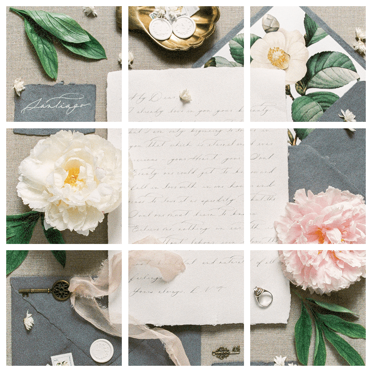
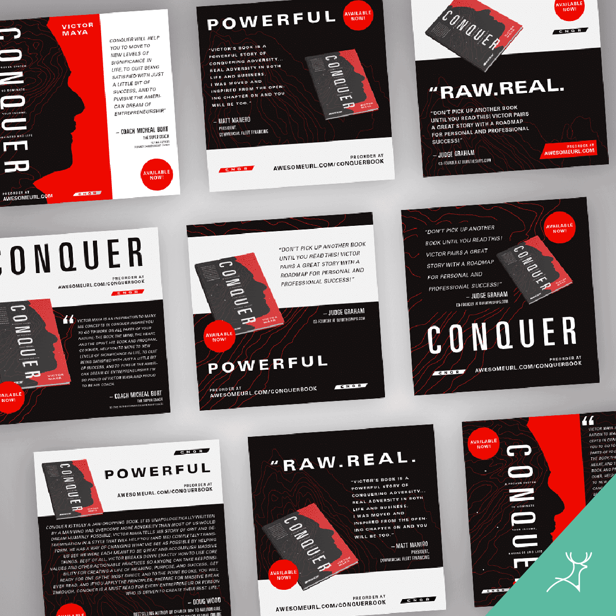
2. Try different layout designs
Whether you’re redirecting traffic to your website or marketing your products or services, a meticulously designed layout like the grid style enables you to visually communicate with your audience.
This is difficult for a non-designer so it’s best to subscribe to an on-demand design service to help you curate your whole IG feed.
3. Use captions written in a clear, easy-on-the-eye font.
A well-conceptualized caption adds character and context to your edited images.
4. Tell your stories by adding videos and illustrations to spice up your content.
How to choose the best type of photo
- Know who your audience is, what they want, and what appeals to them. With that in mind, create posts that draw followers to your marketing world and make them buy.
- Keep it cohesive and consistent. Your IG feed has to blend well with your chosen theme. 60% of the leading brands on Instagram rely on the same imagery to maintain brand consistency on their posts.
- Find high-quality stock images. For startups and small businesses with budget constraints, choose from a variety of free high-quality images that are suitable for your market niche.
- Get an illustrator
How to take great Instagram pictures
- Use natural lighting. The best Instagram shots are those taken indoors made brighter by natural lighting or taken outdoors in open daylight. Natural light makes your photos look crisper and more “real-life”.
- Know when to shoot. Direct sun exposure can be harsh not only to your eyes but to your shots as well. So if you can’t help but shoot at midday, clouds can help diffuse the sunlight to create a softer effect on your photos.
- Don’t get carried away with filtering. Instagram has cool features that offer many editing options. It has filters that you can tinker with to come up with eye-catching posts. Avoid overdoing it though.
- Have Deer Designer edit your photos. Don’t you hate scrapping a photo because there are photobombers? Get us to remove them and improve the photo.
Instagram post design samples
Be intentional
You don’t need to be tech-savvy to have a great-looking Instagram profile. Just follow the simple steps I mentioned to level up your Instagram feed.
Avoid posting just “anything” on Instagram just to fill a gap. Make it intentional and professional. You are running a company here, or a personal brand.
This means that all content must be designed to create more traffic, establish your authority or sell a product.


